ANZ
Working Capital Onboarding Form
The Problems
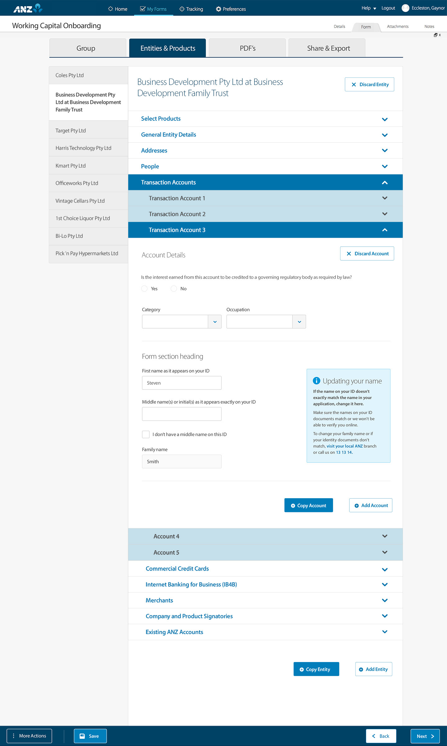
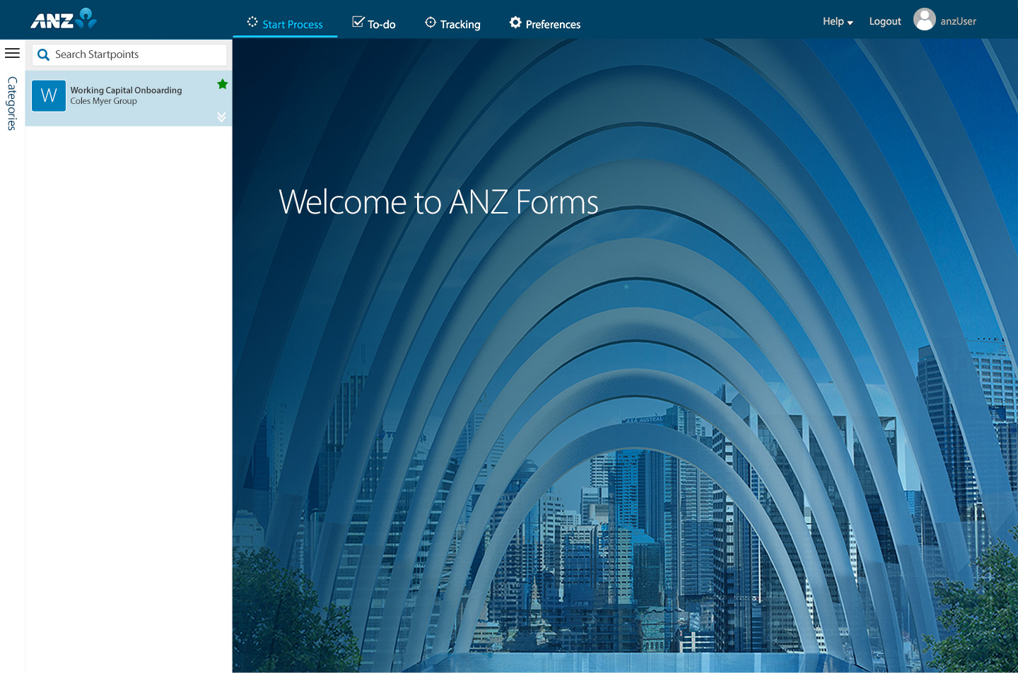
Digitisation of the B2B Enterprise Onboarding paper form using the AEM Forms platform.
- The paper form would often be over 100 pages to onboard large entities containing multiple products with KYC.
- First time use of the AEM Forms application at ANZ.
- The complex form needed to be moved onto AEM Forms with minimal customisation to OOTB.
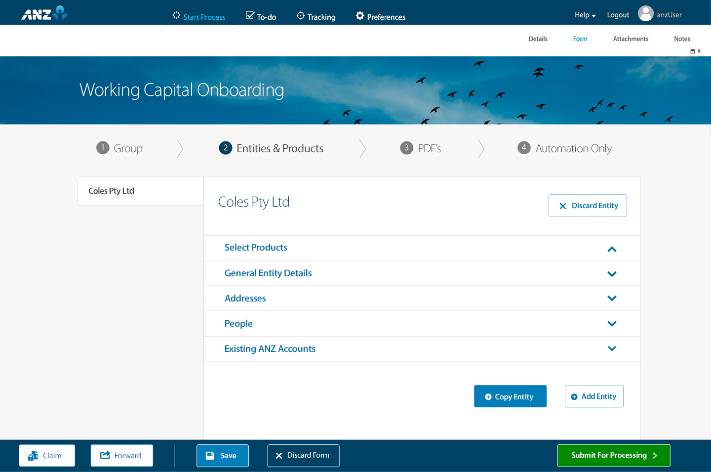
- The AEM forms landing page UI required the ANZ digital brand theme to be added.
The Solutions
- IA mapping workshops helped me to create the UX architecture and user journeys for the end to end form creation and management process.
- Contextual enquiry with stakeholder users was completed followed by wireframe design and testing to refine and enhance the user experience.
- Visual design was completed according to the ANZ design system with the creation of new components and design patterns unique to the B2B and AEM Forms UX UI.
- I identified the ability to reuse the existing ANZ AEM UI framework, allowing us to use time saving global CSS styles instead of the cumbersome OOTB CSS capabilty. I guided the developers in the adoption of the framework into AEM Forms.
- I applied the ANZ Digital Experience Brand directly to the landing page UI code.
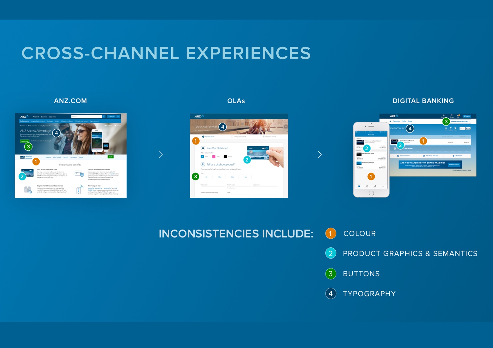
- I completed accessibility testing and reporting for our development team and also the AEM Forms product team.
The Outcomes
- Successful launch of the first AEM Forms product in ANZ opened up a long term roadmap for further adoption of the platform across the bank.
- The digital ANZ Forms platform resulted in a significant reduction in staff time spent on form creation and management.
- The project was completed on time and within budget.
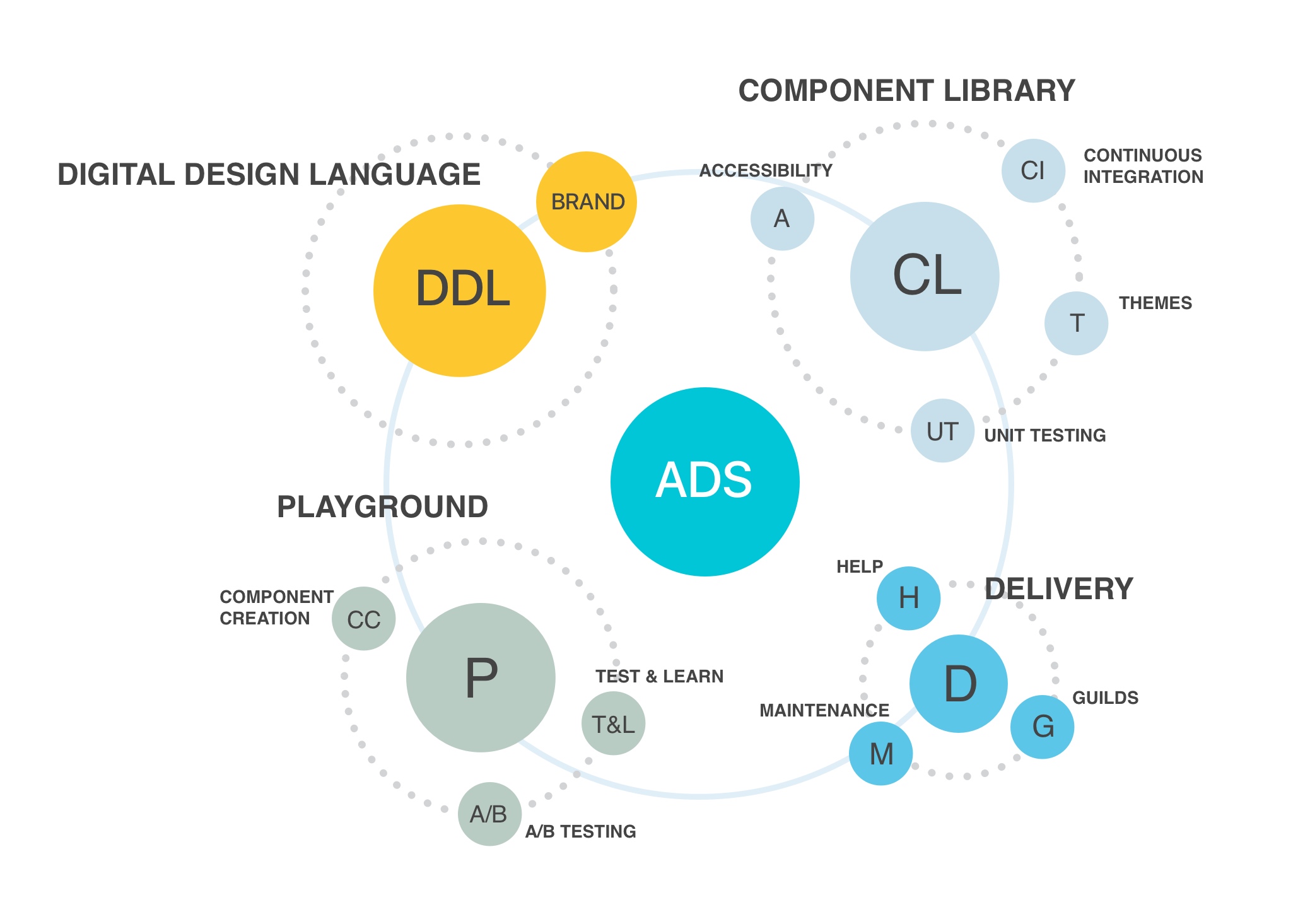
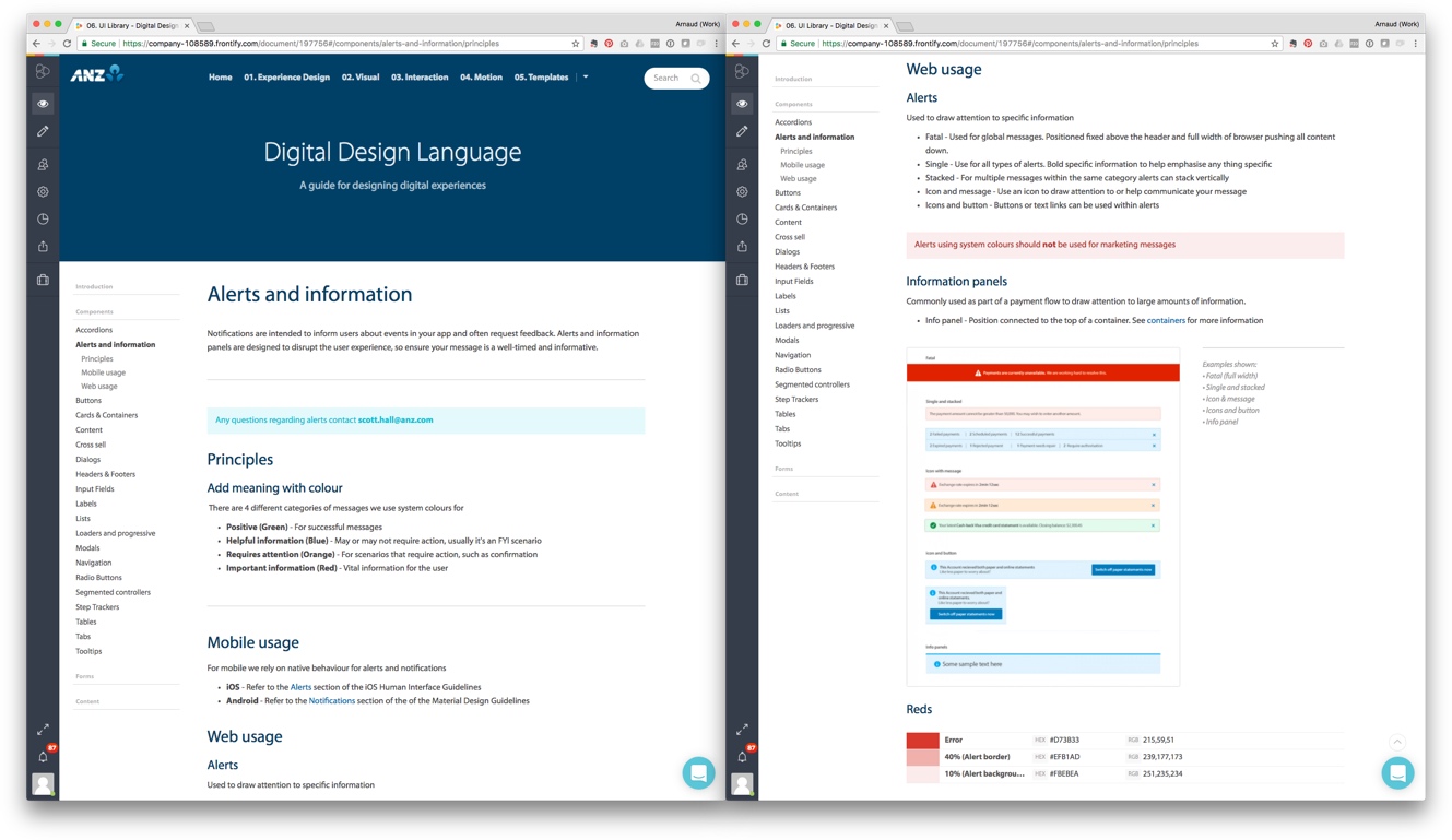
ANZ Design System (ADS)
The Problems
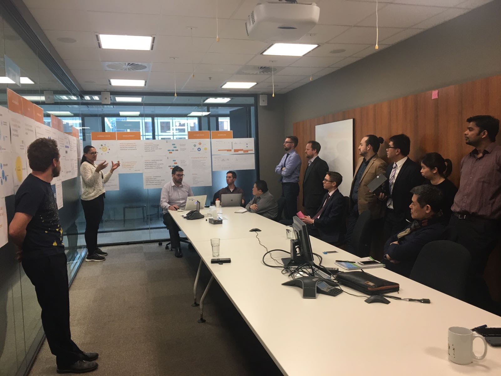
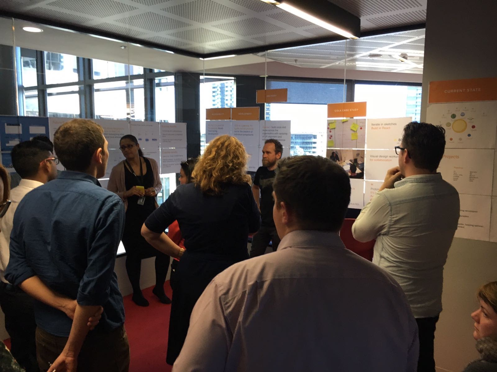
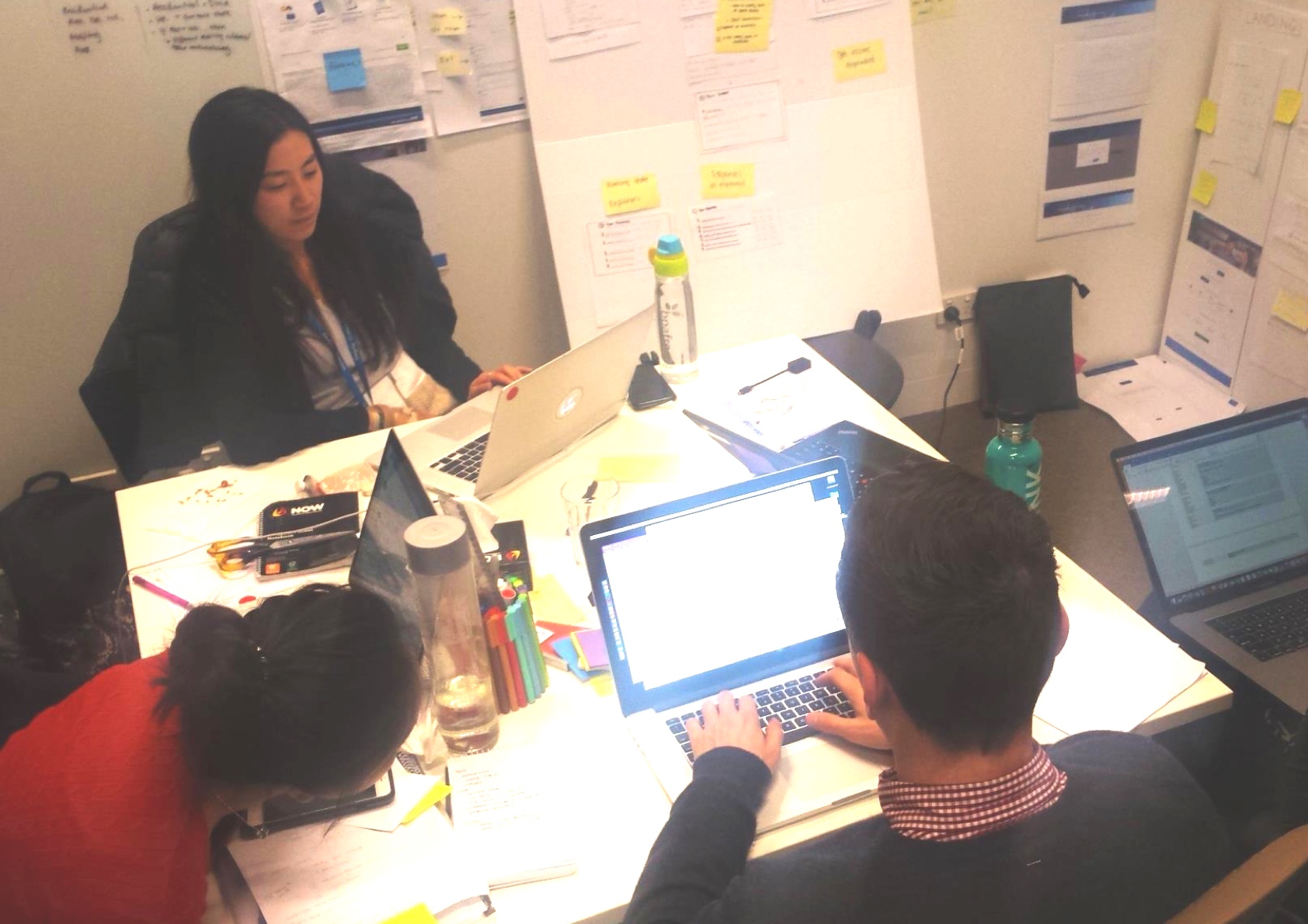
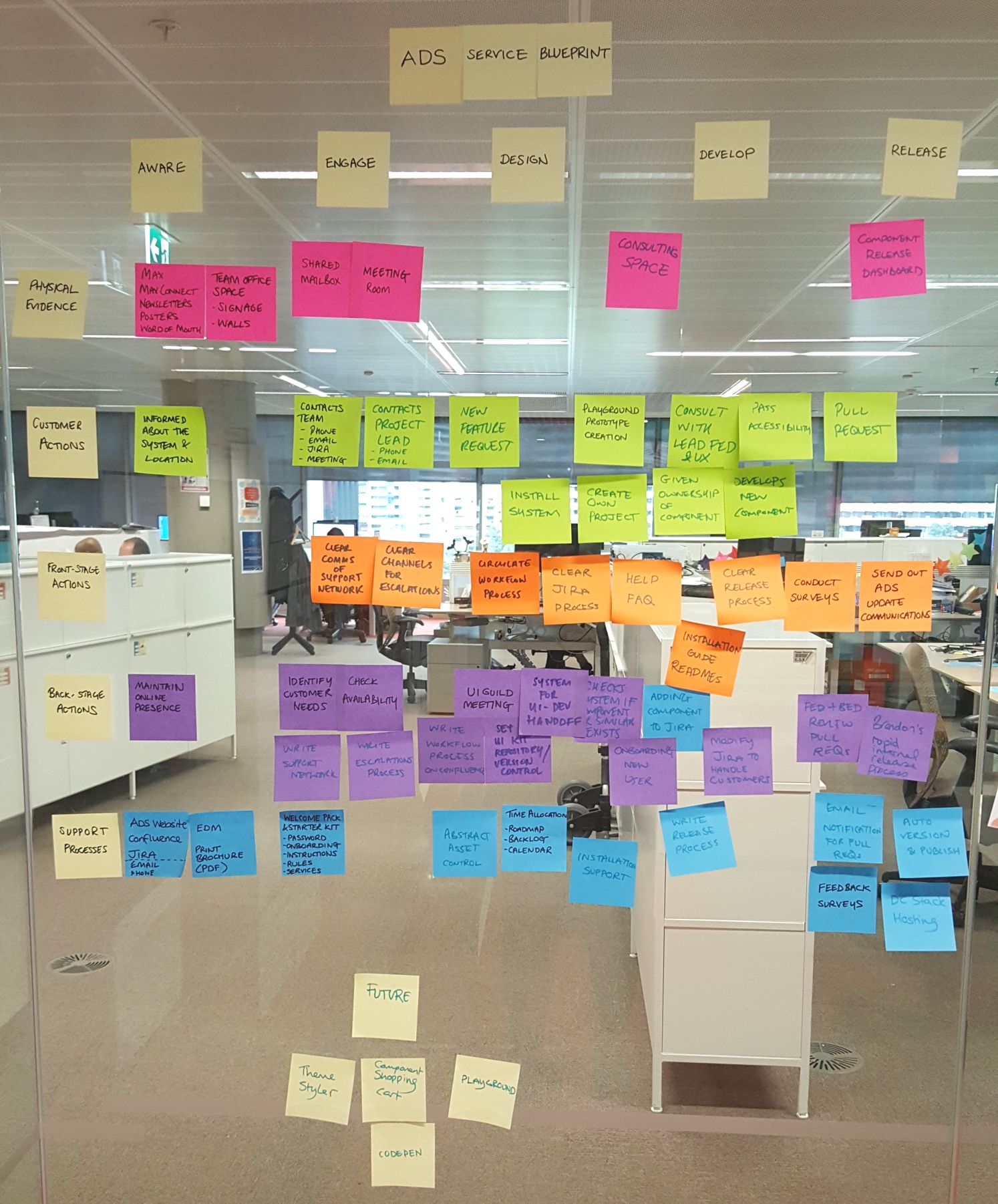
I was part of a start-up squad within ANZ to design, build and sell the ANZ Design System across the bank in Melbourne, Sydney and New Zealand. I collaborated on many different tasks including service design, product design and design of the showcase materials.
The ANZ Design System was created to solve the problems:
- Inability to put products in front of customers quickly.
- Inconsistent ANZ Customer Experience.
- Rapid increase in ANZ digital products during the digital transformation.
- CX Ecosystem silos makes collaboration hard.
- Multiple UI kits with many component variations across the bank.
- Removing the use of redundant artefacts such as Axure.
- Development of new components increased delivery effort per project.
The Solutions
- Core Agile ADS squad of 5 initiated the product and service.
- Collaborative service design to create the end-to-end product and supporting services e.g. incorporated the Digital Design Language.
- Incorporated DesignOps and DevOps ready technologies e.g. Abstract, ReactJS, Docker.
- PoC of the ADS on the existing card online application found development of the form was reduced from 3 months to 2 days.
- Bank-wide pop-up showcases presented to raise awareness and create customer base.
- Onboarded 5 large ANZ projects within 6 months.
The Outcomes
Providing the foundation for ANZ to deliver world-class digital experiences with a unified system to aid collaboration and speed up development.
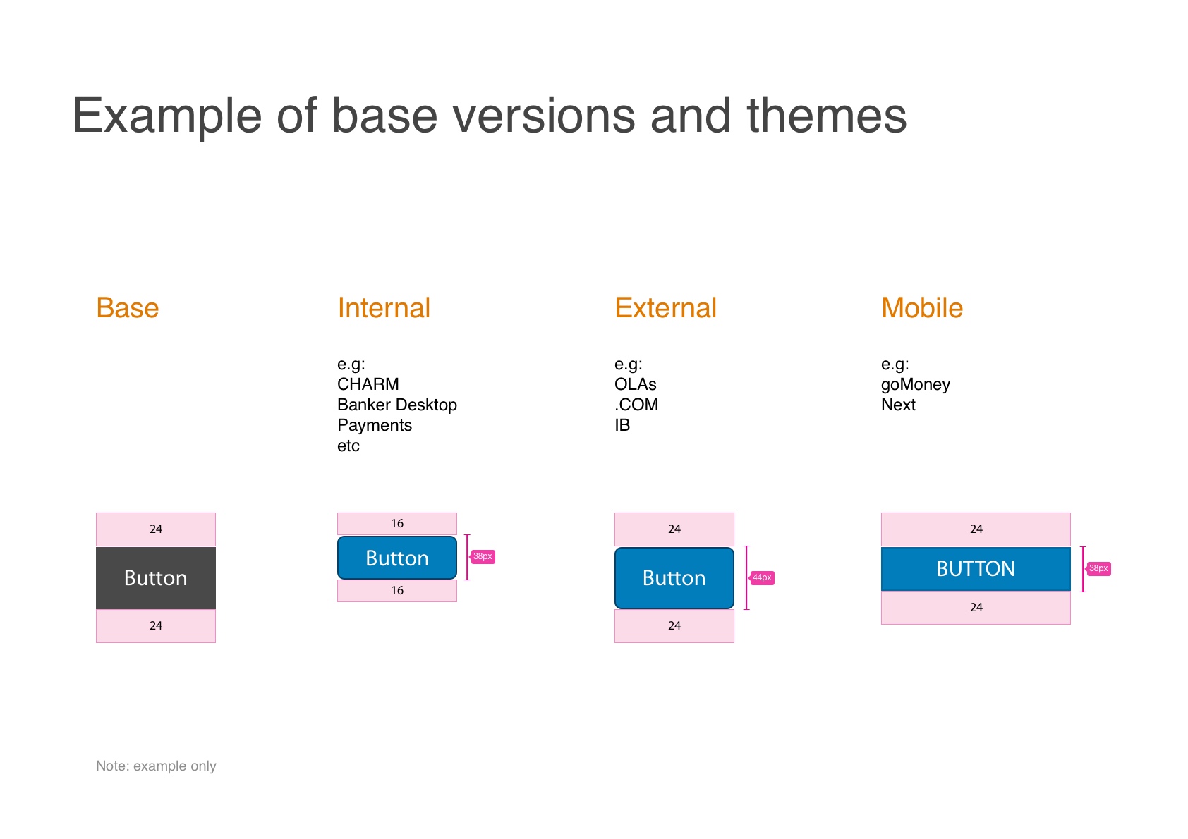
- Reusable React component library housed within an ADS-branded Atlaskit.
- Themes created to allow the same components to be reused for internal, external and mobile products.
- Creation of a dedicated ADS squad and Design Guild to
- Create and maintain the component-level unified design experience providing a single source of truth across ANZ.
- Support delivery teams.
- Sustain advocacy through collaboration and ADS squad / Design Guild rotation.
- Abstract version-controlled UI kits created in Sketch.
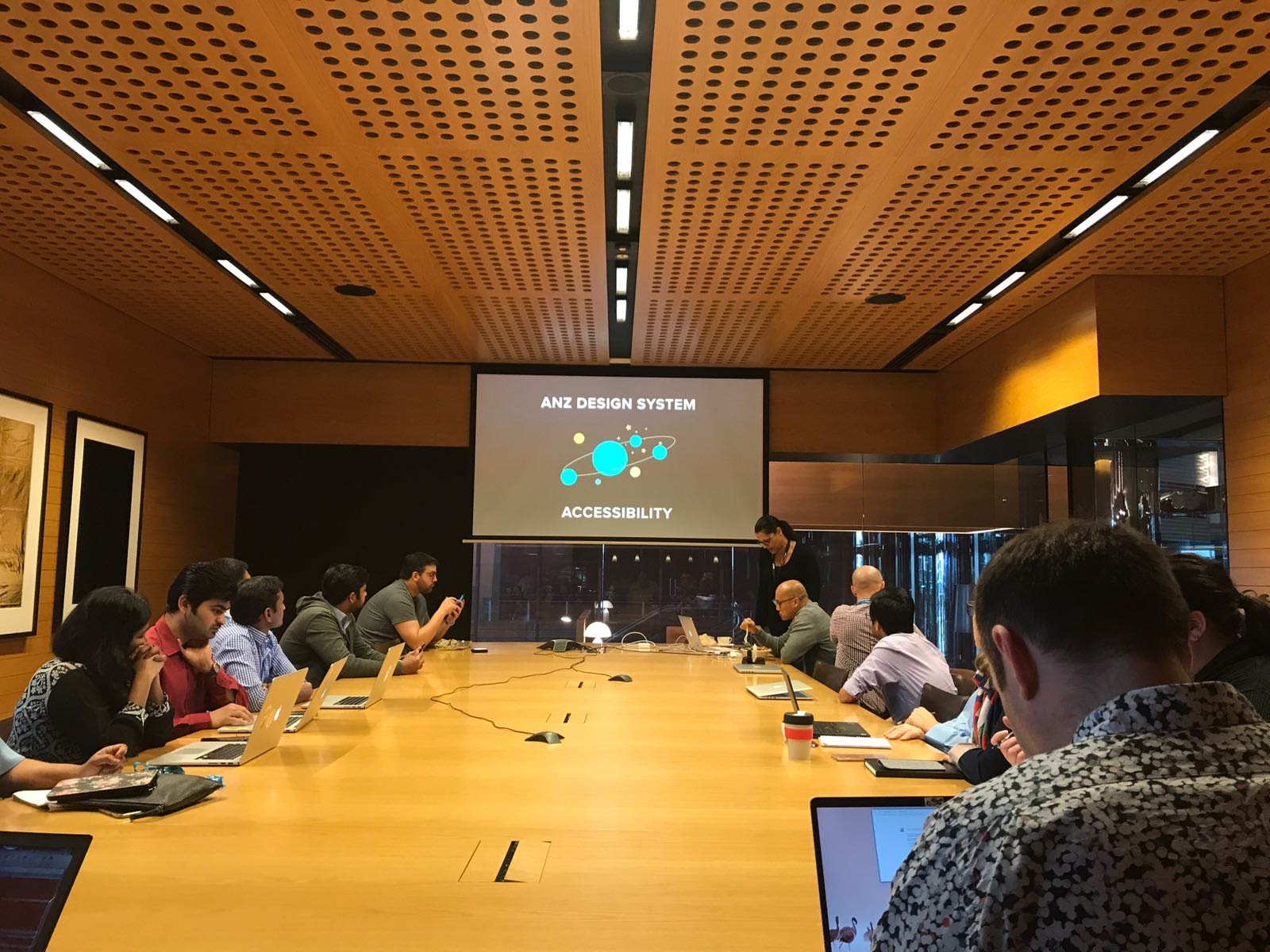
- Accessibility baked-in to meet 95% of accessibility criteria.
- Business benefits in supporting new ways of working and allowing for more craft and creativity.
- Customer benefits through:
- Ease of use.
- Consistent meaning and removing ambiguity.
- Managing expectations with instinctual UX patterns.
- Continuing exploration into the automatic generation of production code to design assets e.g. React to Sketch.
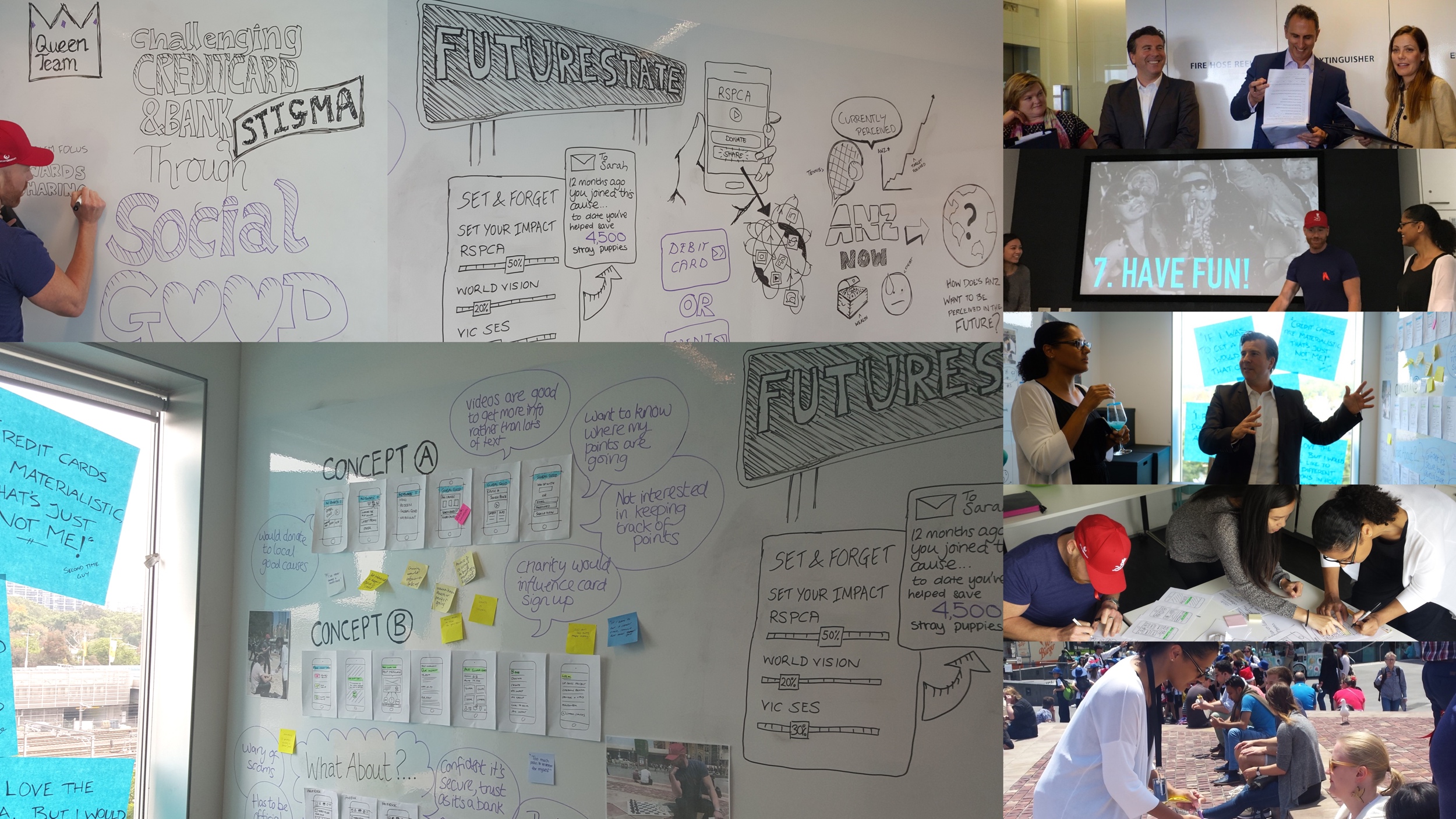
ANZ Rewards Hack Day
The Problems
The ANZ Rewards Team challenged the ANZ Consumer Digital UX Team (partnering with Heath Wallace) to create and test a new feature that could solve the following problems
- Increase customer retention.
- Increase the positive perception and trust in the ANZ Brand.
- Find innovative ways to engage customers and redeem rewards.
The Solutions
- We split into teams and prior to the day each team created a Pecha Kucha style slide deck presentation of our proposal and contextual enquiry user research.
- On the day each team presented their Pecha Kucha proposal then created a schedule of the days activities.
- In the morning we designed 2 concepts and conducted guerrilla usability testing in Federation Square of both.
- In the afternoon we analysed the findings, co-designed solutions and created an immersive presentation of the project that included additional roadmap feature ideas.
The Outcomes
- Both our concepts were to challenge credit card stigma by allowing customers to 'donate' reward points for social good - we called our feature 'Global Good'.
- User testing feedback confirmed some of our assumptions around the stigma of credit card usage, how charity involvement could attract a new user group and also raised common themes in what features customers would engage with and want from a rewards points app such as videos and security.
- We included features such as 'set and forget' to allow users to select multiple donation recipients.
- My team was selected as the winner as the judges valued the combination of uplifting the perception of the ANZ Brand while providing an innovative rewards points redemption feature that could engage current customers and attract new users.
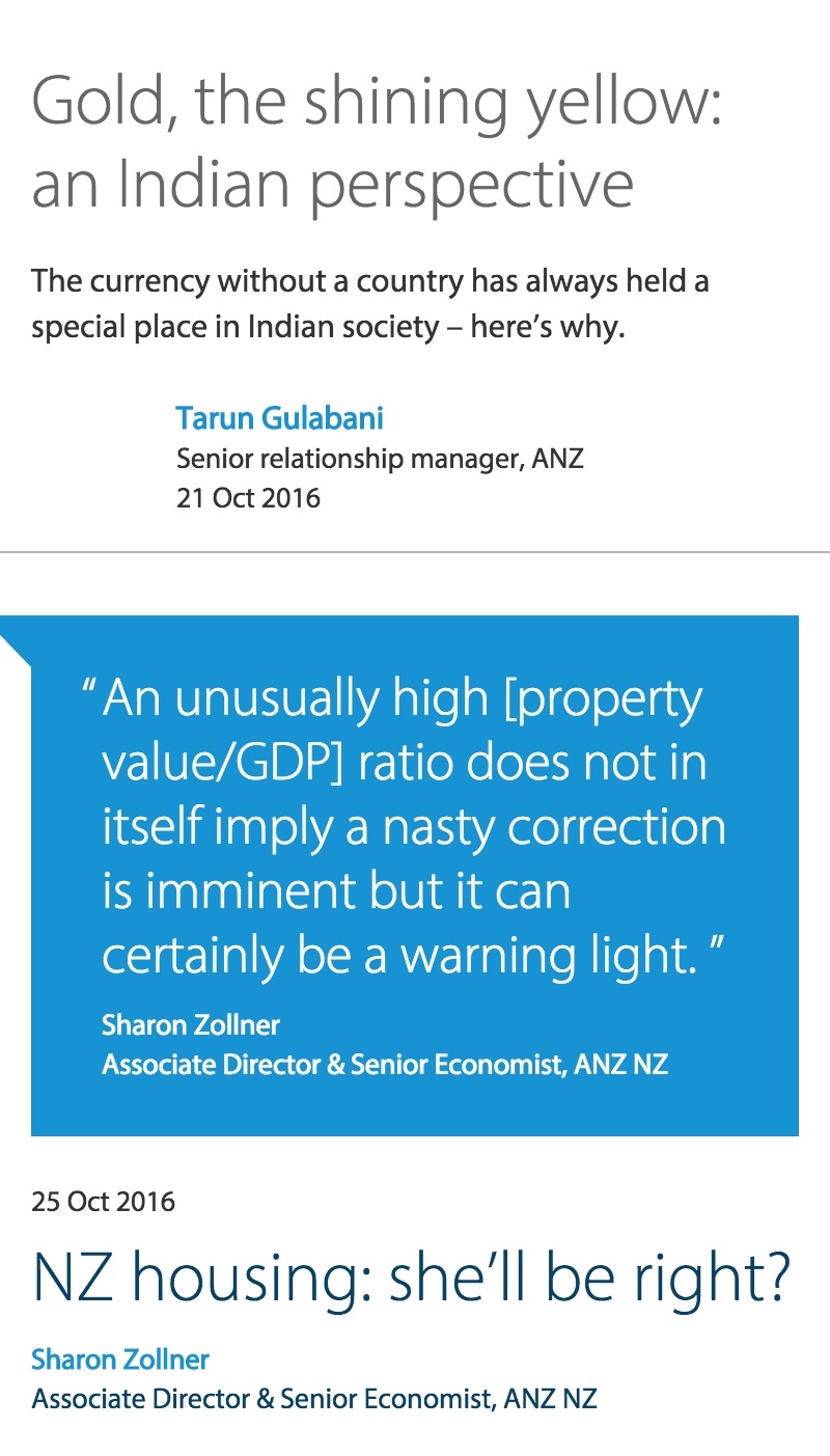
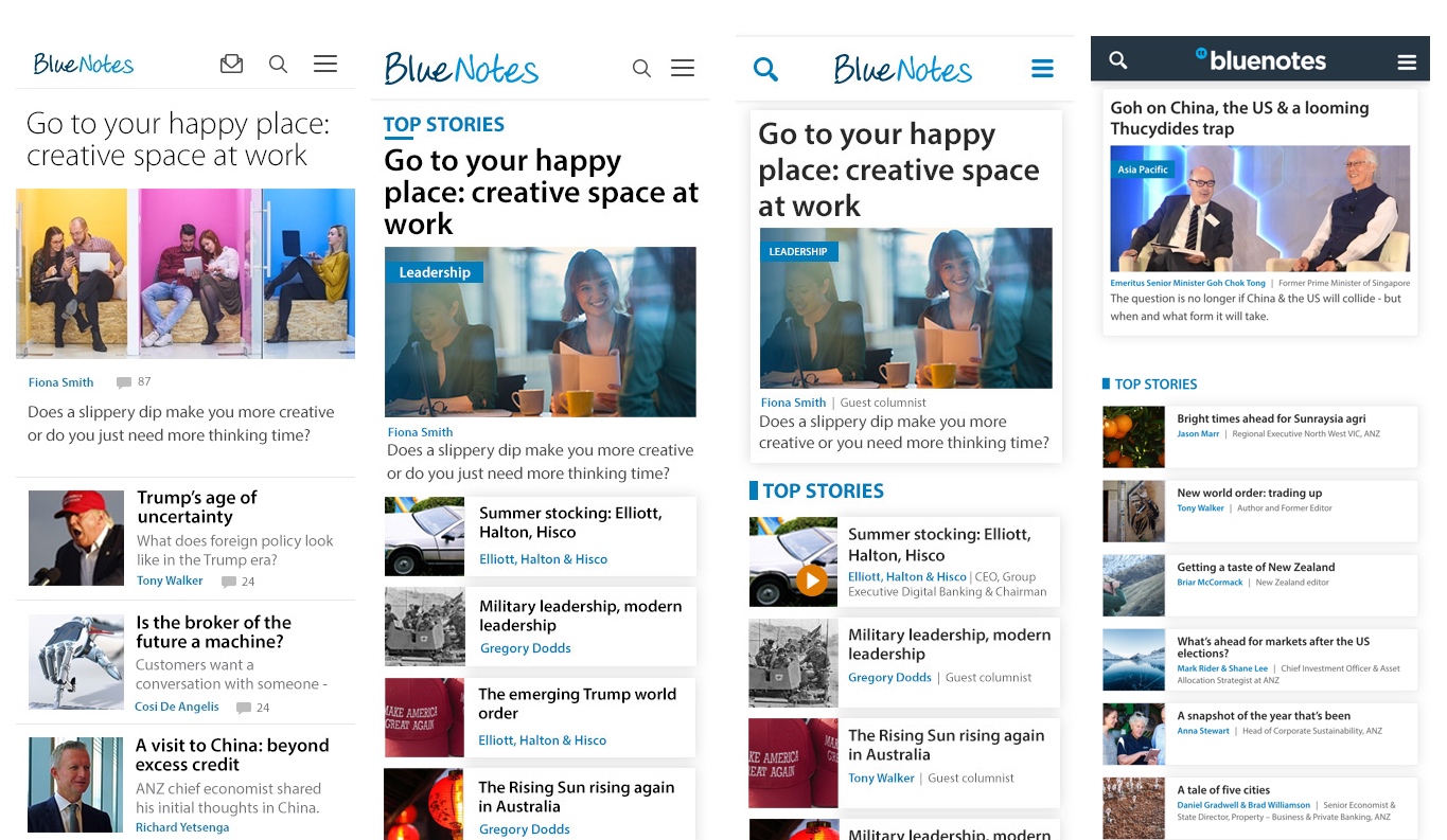
Bluenotes
The Problems
An AEM / AWS re-platforming and redesign of bluenotes.anz.com with a UX uplift was required in 4 development sprints before their current platrom contract expired. My role was to lead the redesign (leading a UX designer and a graduate UX consultant) and consult on the AEM UI development. Challenges included:
- Identifying opportunities and resolve current UX issues to increase their external customer base and increase their partnership with influencers to establish Bluenotes as a thought leadership forum read by CEOs.
- A 25% and increasing mobile user base showing a higher bounce rate on mobile than desktop required a mobile-first responsive design approach.
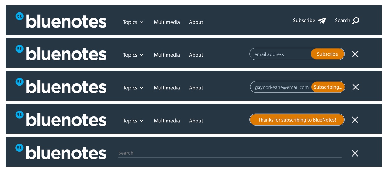
- Enable quick and easy subscription.
- Provide clear and easy navigation and site search.
- Include new features such as tags, video carousel and Tweets.
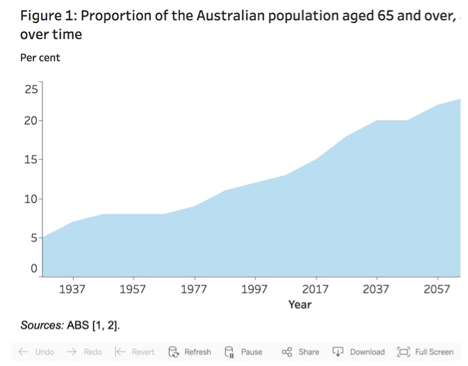
- Allow users to zoom infographics and charts.

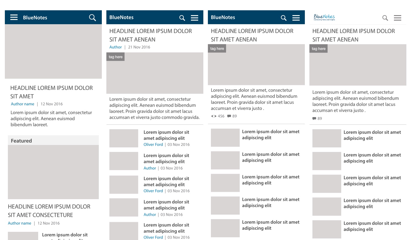
The Solutions
- UX workshop to identify touch and pain points, then plan strategy with priority planning.
- Component audit to determine new and customised AEM components.
- 2 design sprints to complete interactive prototype and usability testing.
- A further 2 design sprints to complete visual design.
- Qualitative one-on-one user sessions to validate UX and UI designs.
- Incorporating feedback from the first round of user testing and re-tested taking SUS scores from a B to an A grade.
The Outcomes
- A prominent subscribe form with clear error and success messages.
- Incorporated omtimal typography for online reading including line length.
- Small quick win features were also incorporated such as a the date to show content is current and allowing users to hit the keyboard enter key to submit forms.
- Filters and load more capability on the search results page.
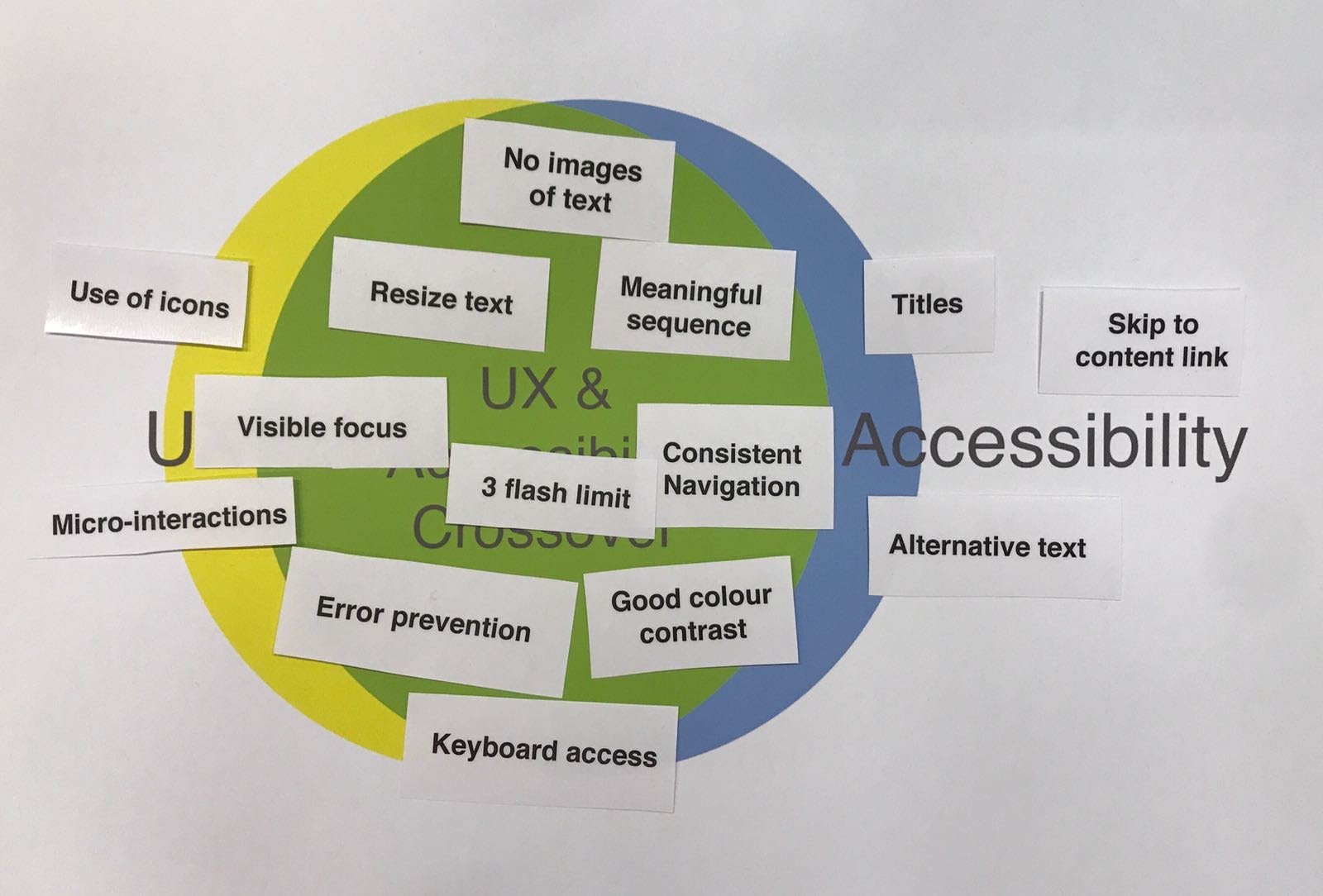
UX & UI Illustration
The Problems
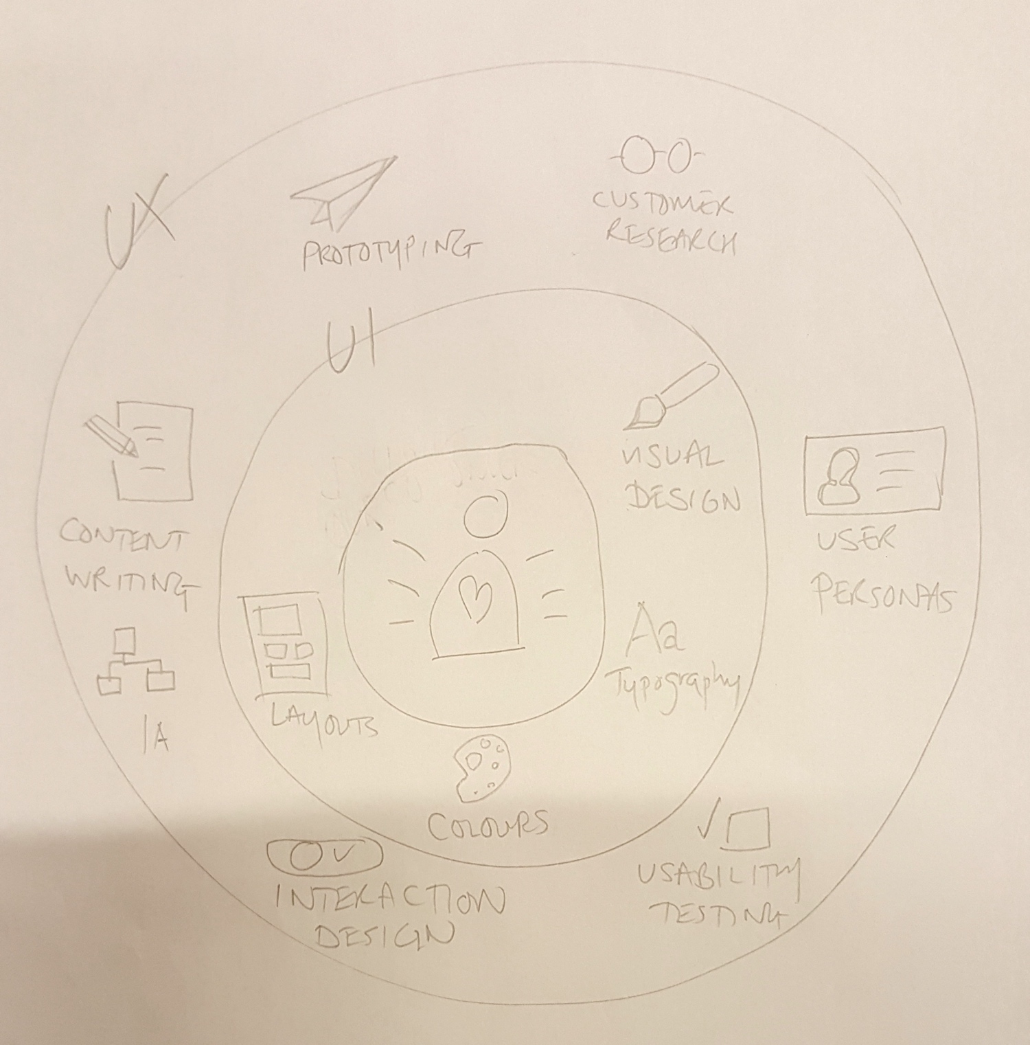
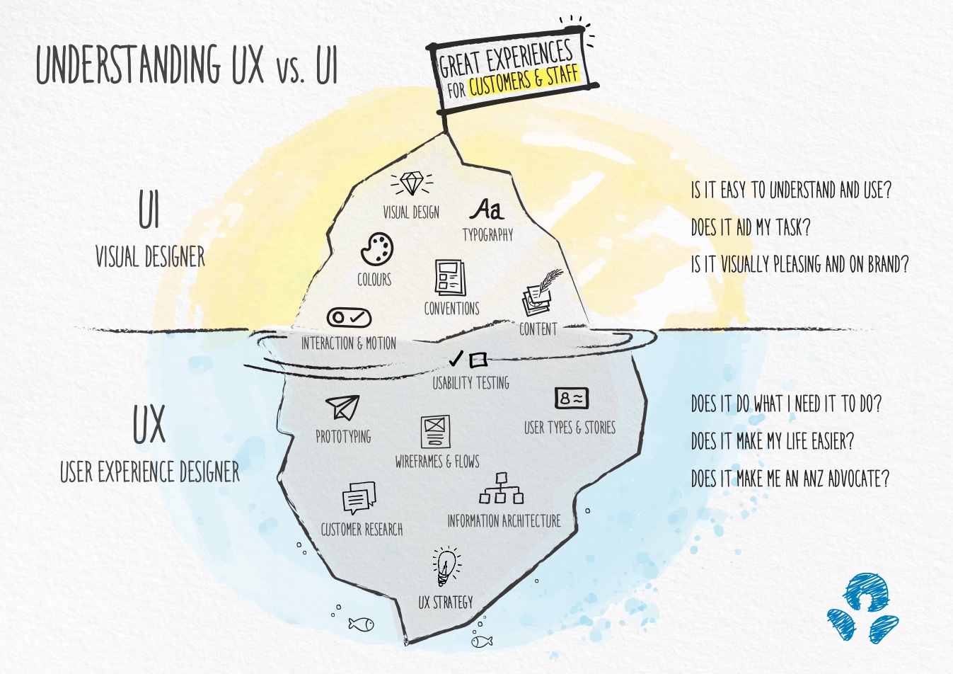
The ANZ Chief Design Officer (CDO) requested a visual to clearly describe the differences between UX and UI design as a tool to easily demonstrate to the new ANZ Digital Transformation Tribe Leads, what technical skillsets they should consider for their tribe members.
- A single visual should be clean and uncluttered to be quickly and eassily understood.
- All the disciplines that fall within UX and UI should be included.
- A collaborative effort was required to ensure ANZ-wide agreement of the visual.
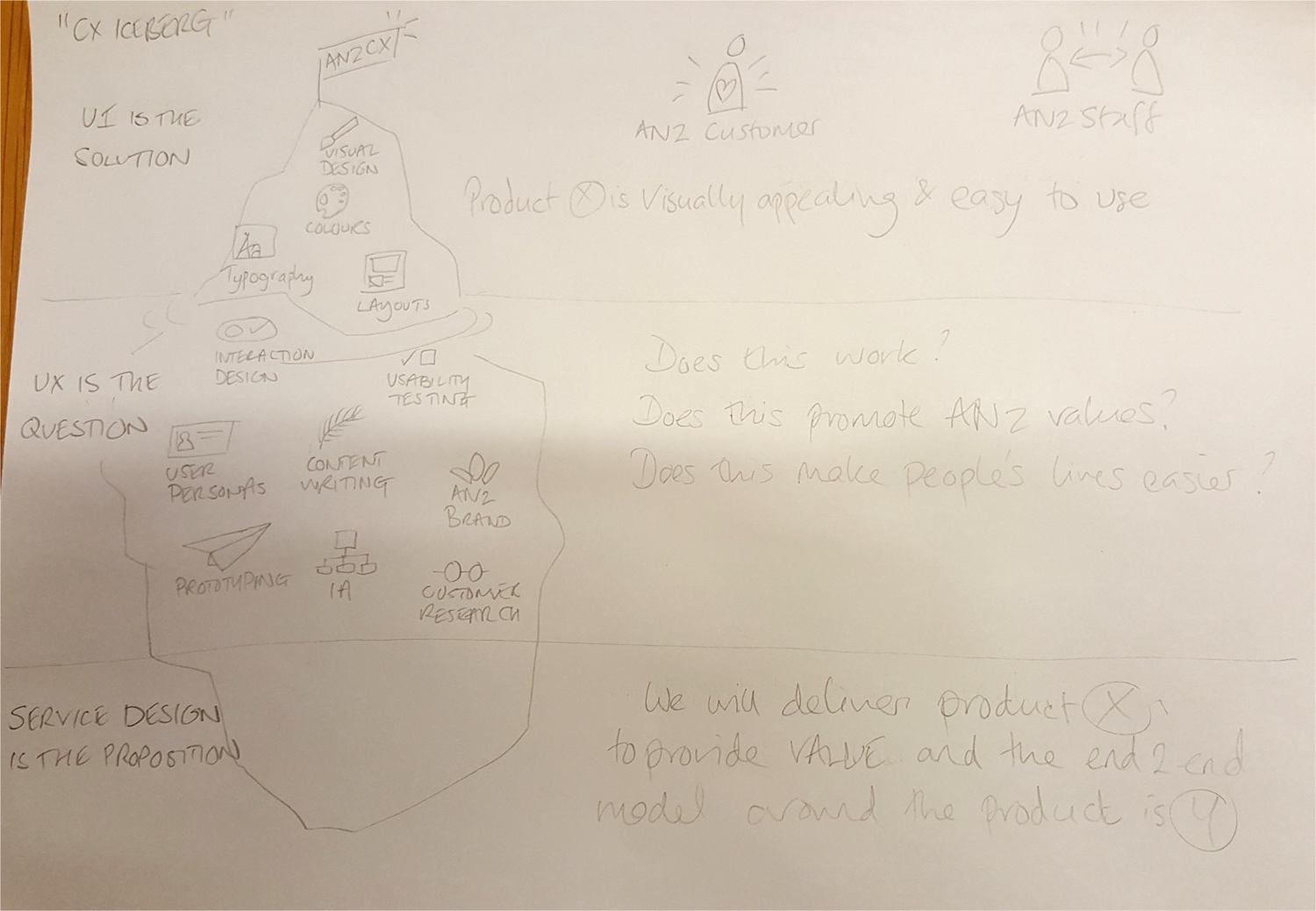
The Solutions
- I paired with another UX designer to brainstorm and pencil sketch initial concepts.
- UX leads and the CDO reviewed the concepts and we chose one concept to work thorugh to completion.
- I sketched the next iterations and included all leadership feedback.
- Co-design with a UX lead was carried out to create some of the new icons.
- The final visual was completed in sketch using the new ANZ internal brand styling and sign off on the final illustration was provided by the CDO.
The Outcomes
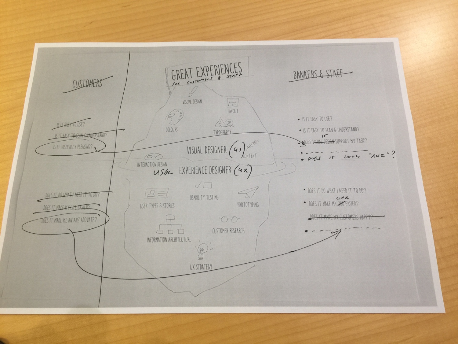
- The commonly used 'iceberg' illustration was selected as it provides a clear depiction of what happens 'beneath the surface' as well as what customers see 'above the surface' as they use the product.
- Icons that follow the ANZ internal brand would all fit within the iceberg, through co-design we were able to uncover additional disciplines that may have not otherwise been included e.g. Conventions which is an important consideration in UI layouts.
- The questions were an important companion to the iceberg to clearly describe the over-arching objectives of UX and UI.
- Accessibility should be baked-in to all disciplines so we didn't include this as an individual icon within the iceberg.
ANZ
Home Loans Online Application (HOLA)
The Problems
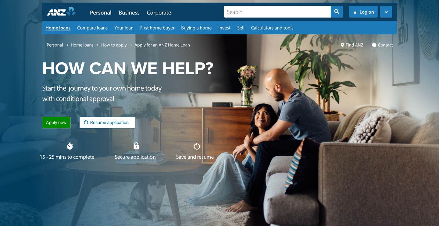
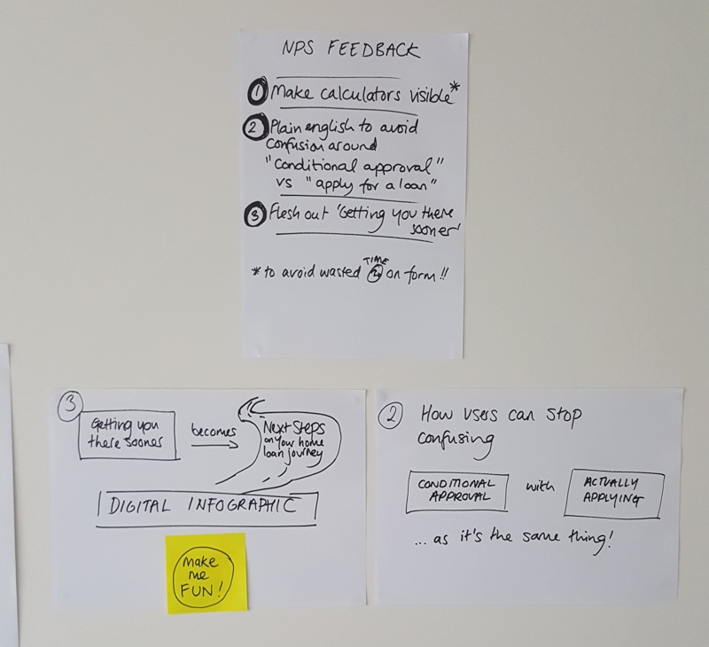
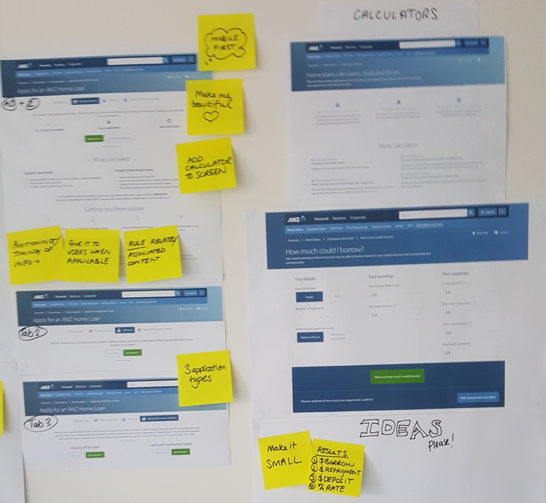
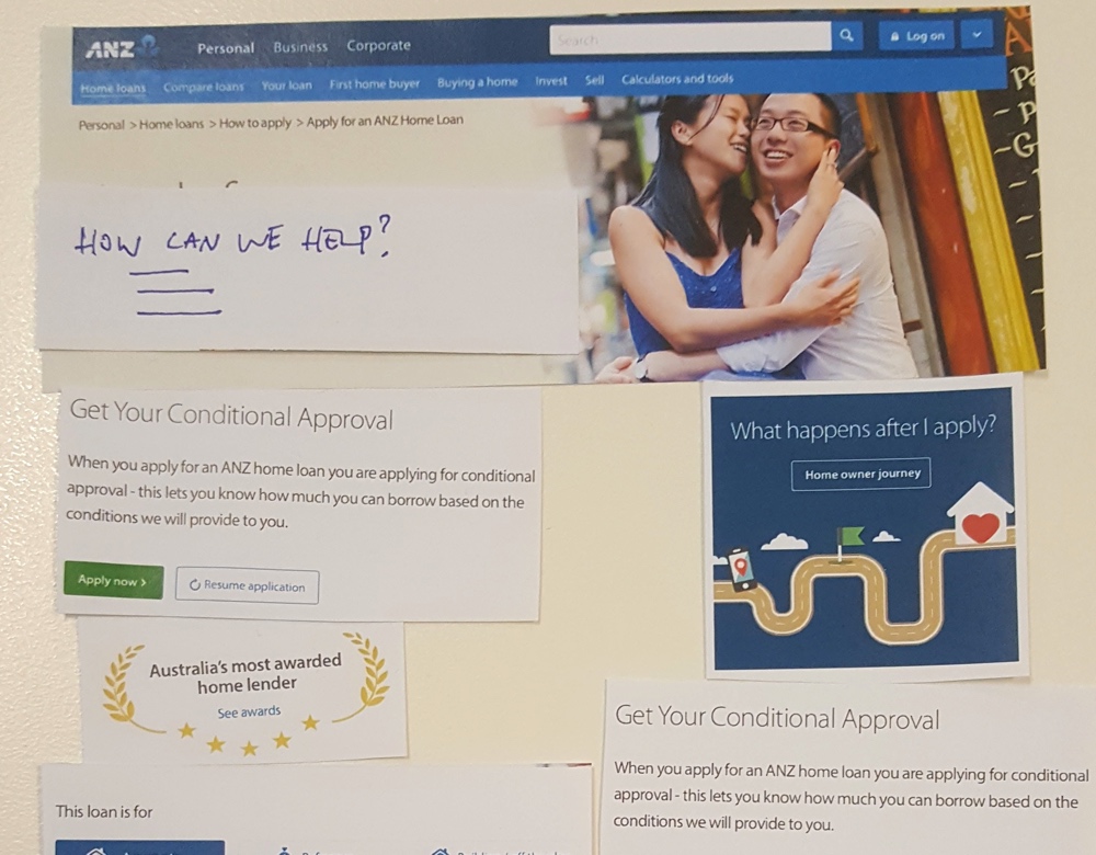
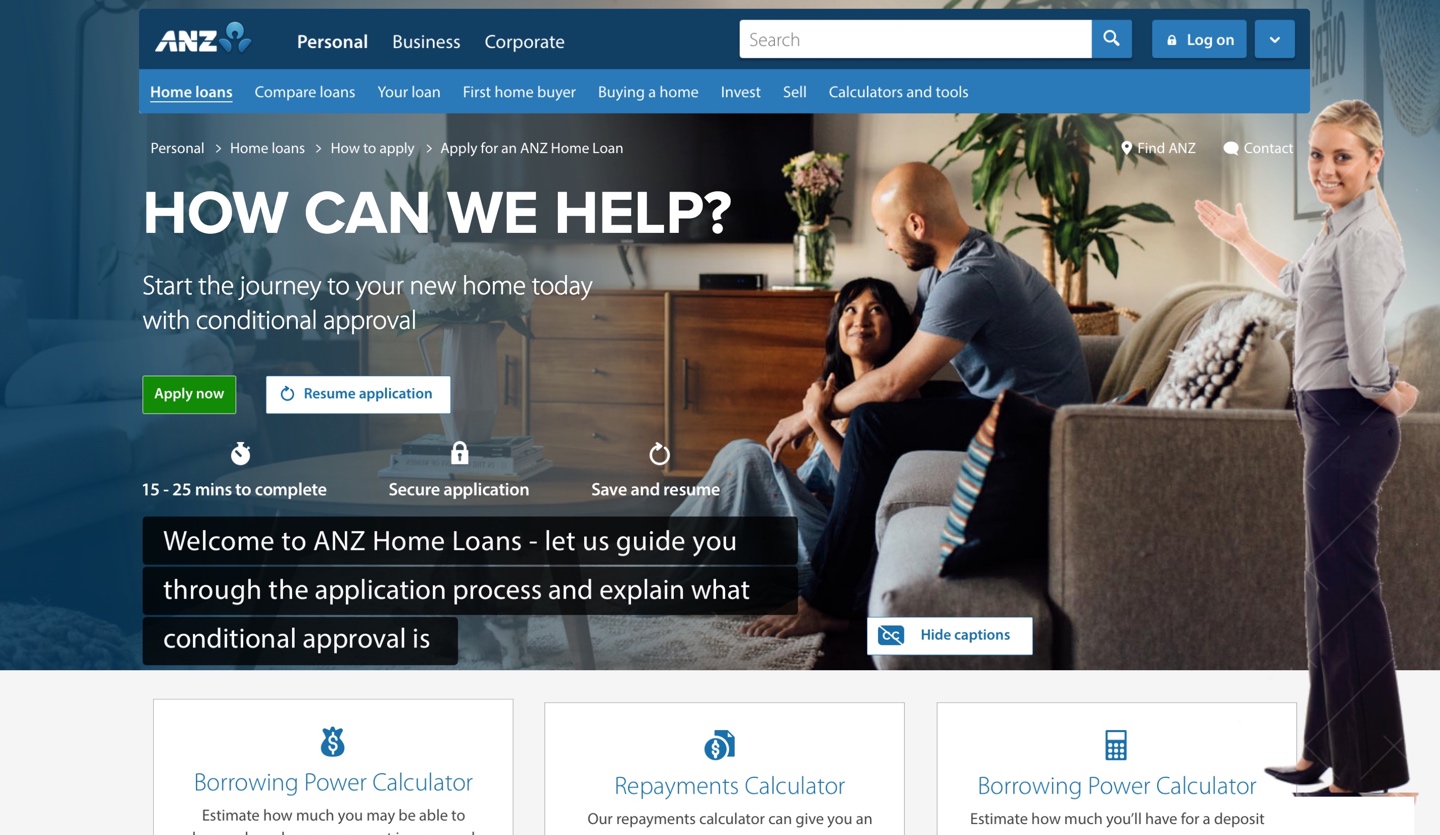
NPS (Net Promoter Score) user feedback raised key issues with the current online form directly increasing customer churn.
- Home loan jargon (industry terms) isn't understood - this has a knock on effect of users not understanding what they are applying for and how the home loan process works.
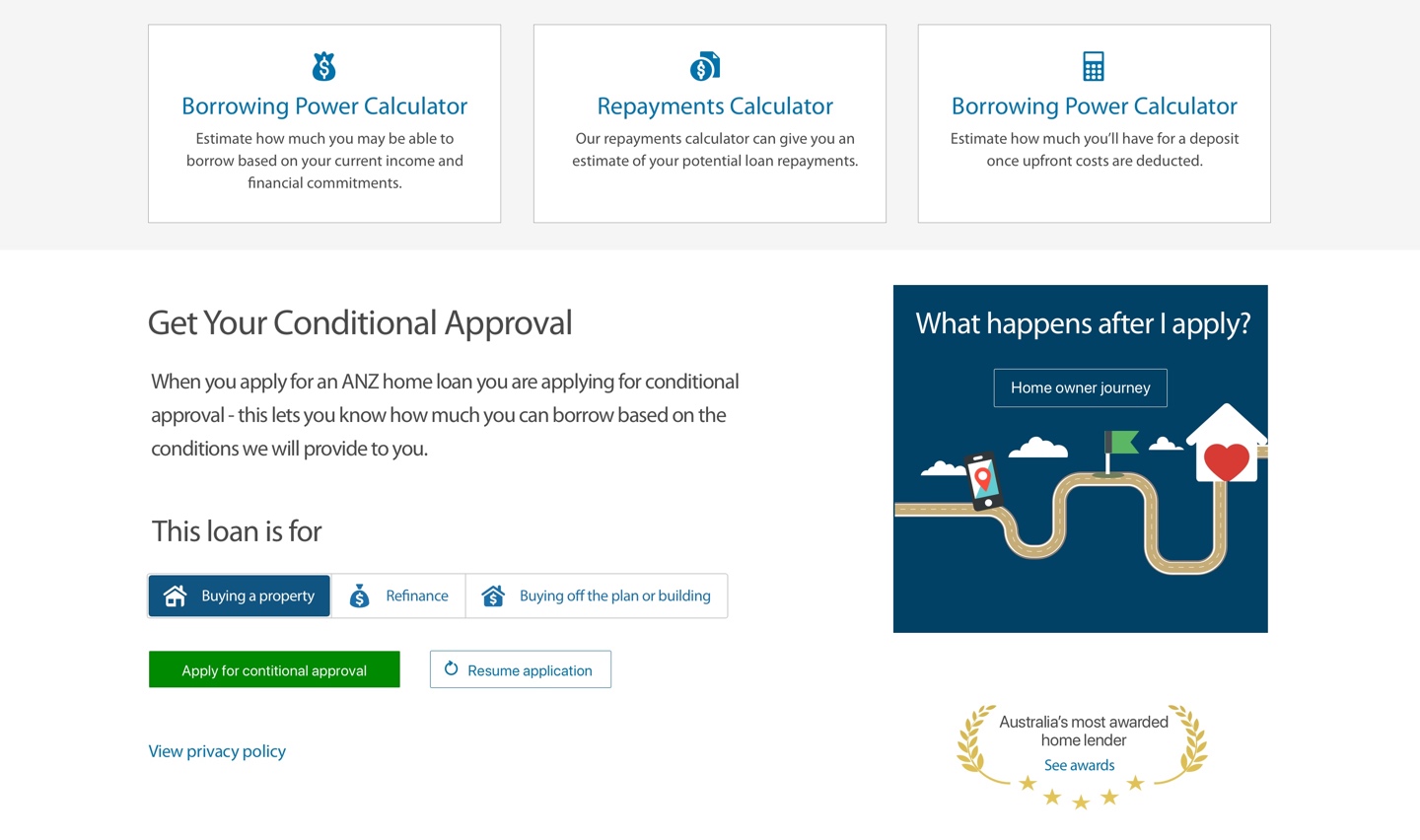
- Users couldn't easily locate the home loan calculators.
- Users didn't understand the next steps after submitting the form.
- A refresh of the visual design and new feature testing was also requested.
The Solutions
- User feedback and competitor analysis followed by co-design sessions leading to iterated sketched wireframes.
- Desktop only (stakeholder requested) high fidelity visual design concepts.
- A human introduction video overlay (stakeholder requested) was applied - effectiveness of the feature would be measured via user testing feedback.
- Interactive rapid prototype to demonstrate introduction video and user interactions.
The Outcomes
- New copywriting to clearly show users what they are applying for and a plain english description of the term 'Conditional Approval'.
- Prominent display of the home loan calculators.
- Renaming of 'Getting you there sooner' to 'What happens after I apply' to remove ambiguity.
- Provide an interactive infographic to present users with a clear step-by-step overview of the end-to-end home loan buying process with assistance from ANZ.
- The visual design and choice of imagery was created to align better with the ANZ Digital Experience Brand.