Vlocity
Hydro Québec B2B2C/B2B Energy Management Analytics Dashboard Sales Demo
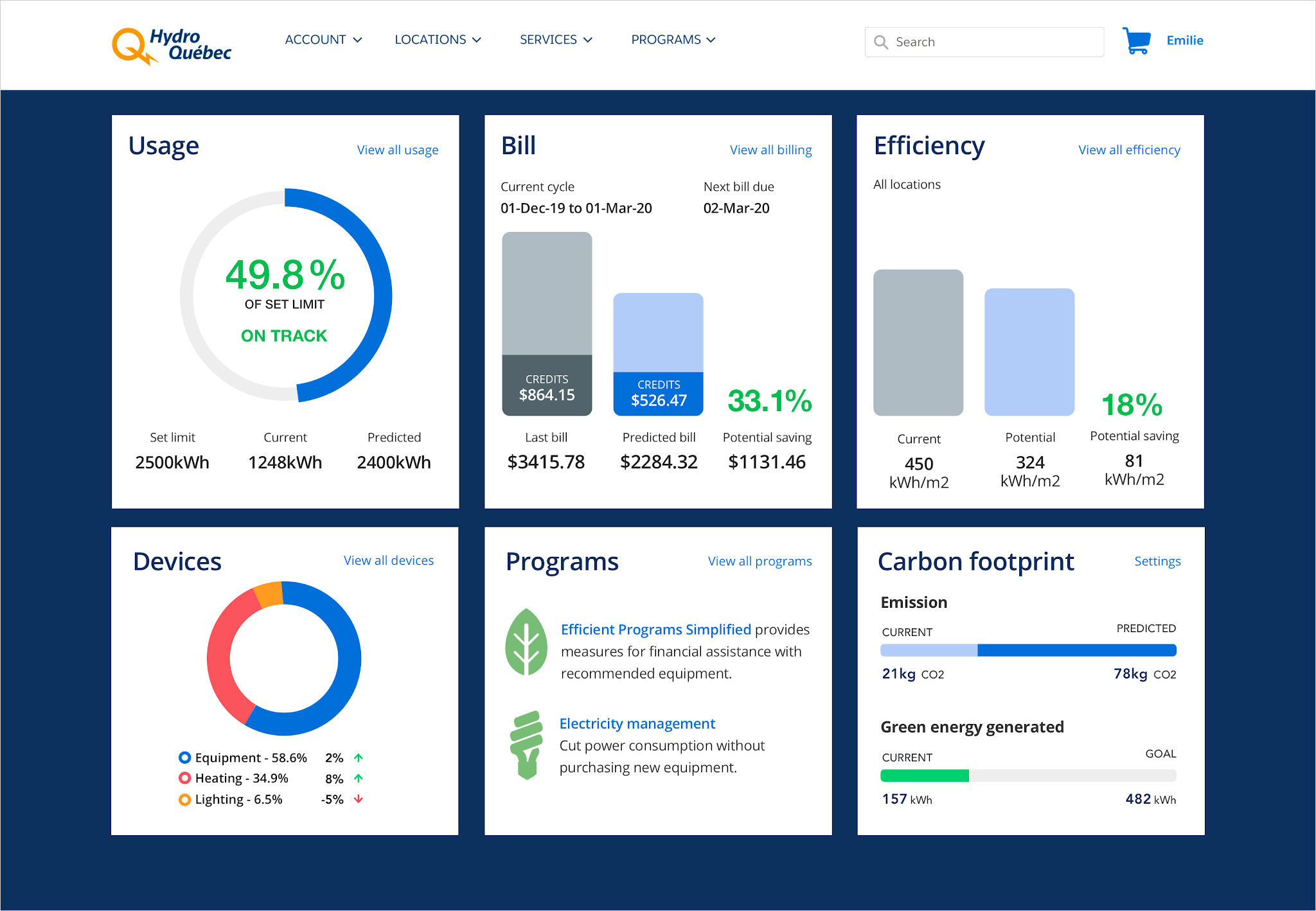
The Problem
- A solution engineer in the energy presales team needed a high resolution, dashboard design for a versatile B2B2C/B2B authenticated self-service portal to win a Vlocity contract with Hydro Québec.
- The dashboard UI needed to showcase the full capabilities of the Vlocity Energy platform, integrating multiple Salesforce features with multiple AI prediction data points and deltas.
- Typically solution engineers would rely on me to provide a complete concept UI from a high level brief and then they would provide inputs for any additions or small changes required.
- As with all requests from solution engineers, requests would be short notice and a rapid completion of the design within a few days was critical in order for them to present solutions to executives who needed clear, future-state presentations of the full capabilities of Vlocity and Salesforce combined to enable them to make informed decisions around which platforms and product licences best suit their needs.
Presales, Business & User Success Metrics
- Demonstrate Vlocity's edge over competitors via OOTB tools to increase operational efficiency, growth, sustainability, automation, and AI with real-time data.
- Present end users with a clear, transparent and impactful snapshot of their products and services, with real-time service usage, costs and potential savings.
- Minimise solution enineer input time - be proactive and research and incorporate as many real world and future-state features as possible in the initial concept. This prevents me having to request more detailed requirements and having long discussions with the solution engineer, freeing up their valuable time to complete their other multiple critical, complex and time-sensitive tasks.
- A polished UI in Hydro Québec's digital brand theme to a top design agency standard, allowing Hydro Québec's executives to connect Vlocity with their brand and to demonstrate Vlocity's seamless integration.
- Meet all mobile-first, human-centered design, UX heuristics and accessibility criteria to;
- Present the clearest, impactful and intuitive UI as possible.
- Enable rapid mobile-first responsive mobile and tablet resolution UI creation if required.
The Solution
- I can typically go straight to high fidelity designs as I can work rapidly in Figma pulling components from design systems and am able to rapidly modify and create new componets as required, plus I know how to bake-in responsive, UX and accessibility criteria along with reusable UX patterns, features and data heirarchy. So this was my approach to completing this UI.
- Each design request draws on aspects of my ever evolving 'hidden' skillset of being a self-starter and researching and identifying new approaches that will enable me to complete tasks faster, with more innovation and accuracy. In this case, I needed to quickly understand the needs of Hydro Québec's energy product and service models, and self-service personas, along with what would be real world user stories and feature prioritisation that would result in my proposed UI concept.
- I rapidly researched various top global energy companies ecommerce websites and self-service portals to grasp enough of a cross-section of leading product and service models that enabled me to identify the most pertinent features and data to display on the dashboard UI.
- The dashboard design for a self-service portal would be built using the OOTB Salesforce Experience Cloud mobile-first portal platform, with Vlocity flexcards displaying all the UI components within it. So I worked to maximise the platform capabilities while keeping within restrictions to maximise configuration capabilities and minimise customisation.
- I identified and added all the specific data points with predictions and deltas to demonstrate the power of the Vlocity platform, including Einstein-powered predictive AI features.
- I added clear content writing examples within the UI to match the portal's information architercture and navigation, alongside energy industry terminology and labels.
M1 Ecommerce Bakeoff, Singapore 2019
The Problems
The M1 Ecommerce Bakeoff took place over 3 days in Singapore in 2019. In this final round Vlocity competed against 2 other companies including Whale Cloud for the M1 ecommerce platform contract.
Requirements included:
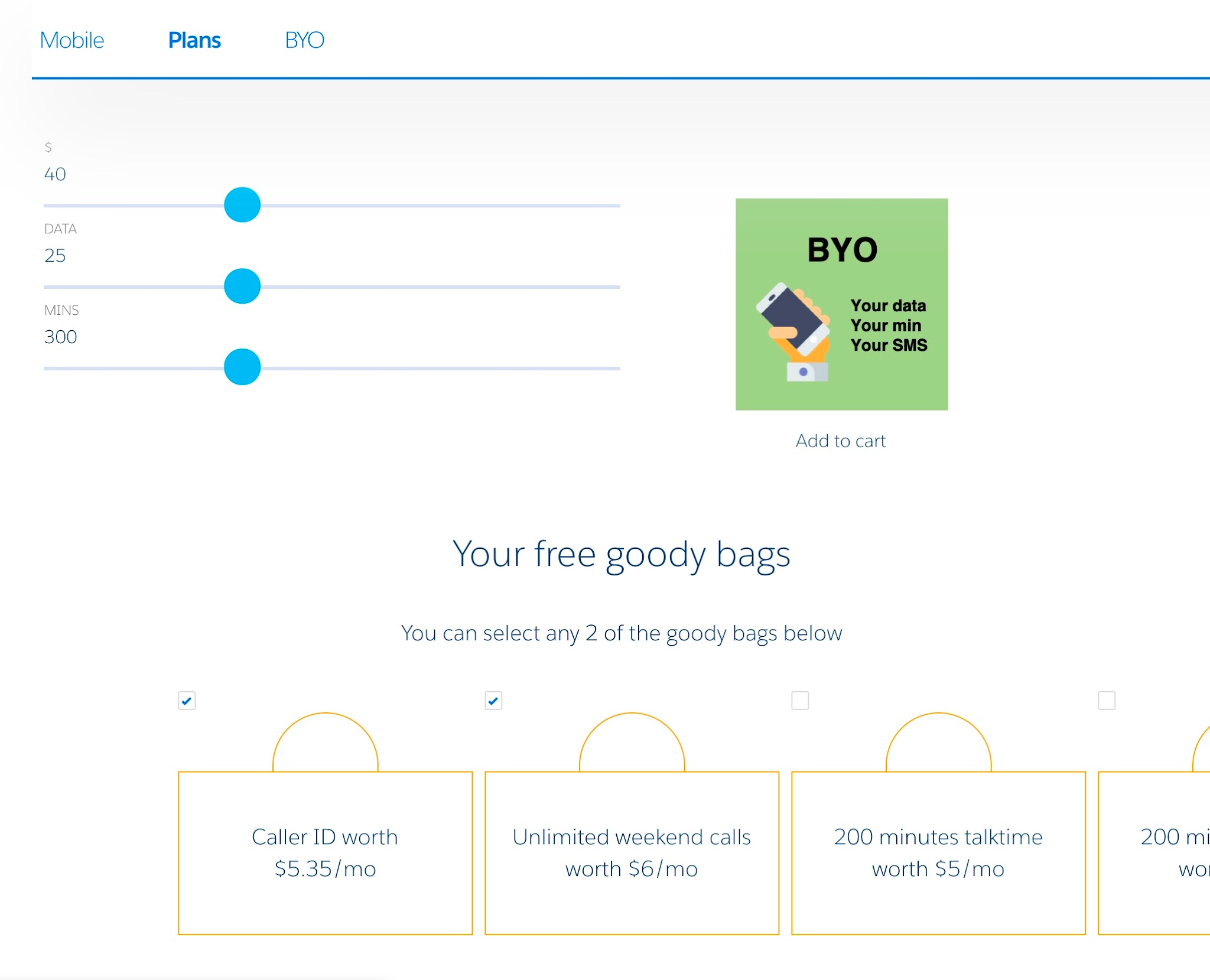
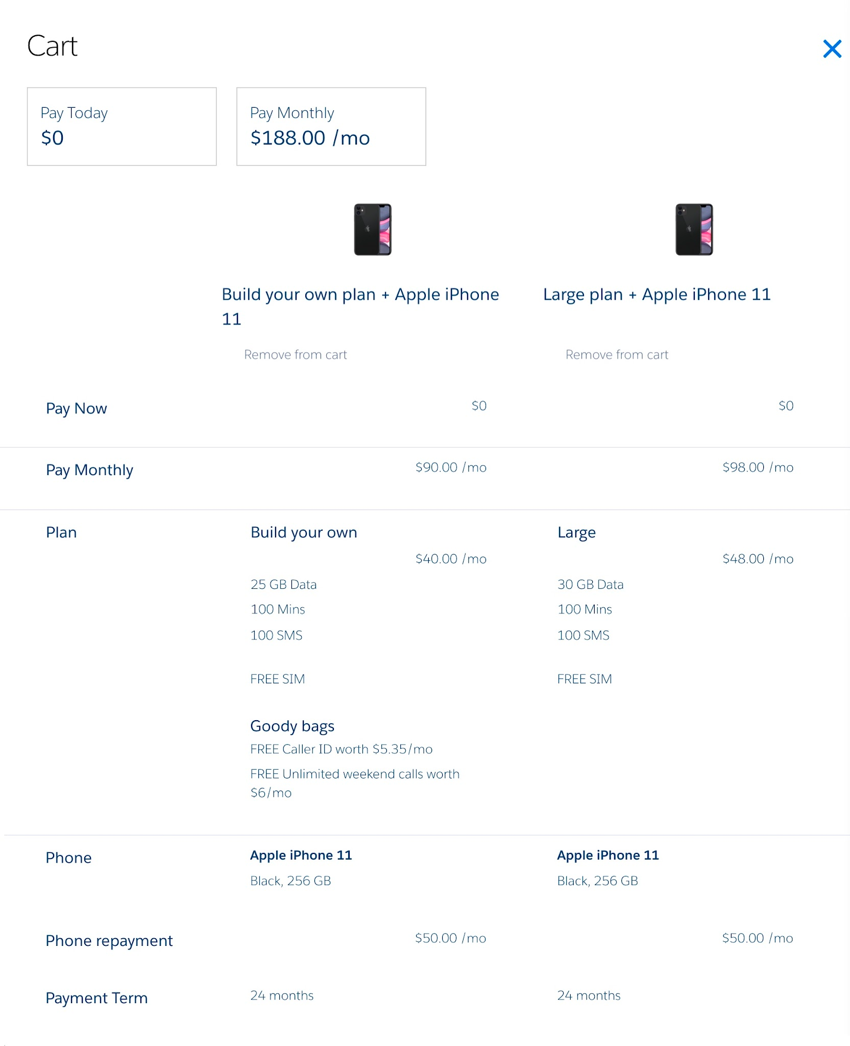
- Design and build of an end-to-end ecommerce user journey to purchase an iPhone and recontract to a postpaid mobile service.
- Include a personalised offer upon authentication.
- Ability for the user to see the 'next best option'.
- Ability for the user to customise their plan.
- Ability for the user to compare options and see the total cost of ownership (TCO).
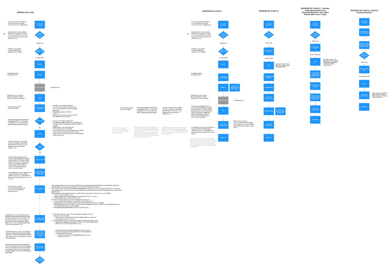

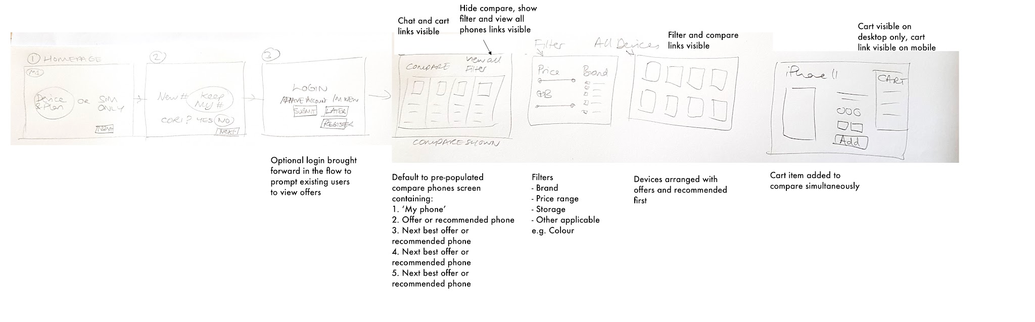
The Solutions
- I created the initial process flow based on all the M1 Bakeoff requirements.
- I rapidly identified opportunities for an enhanced user journey without compromising on required UX & UI features by simplifying the process flow from 18 steps to 8 (over 50%).
- I presented the simplified process flow to the rest of the Vlocity team who were dependent on me for a design-first solution that the solution engineers could then follow to configure the supporting CPQ cart, products, dataraptors and integration procedures.
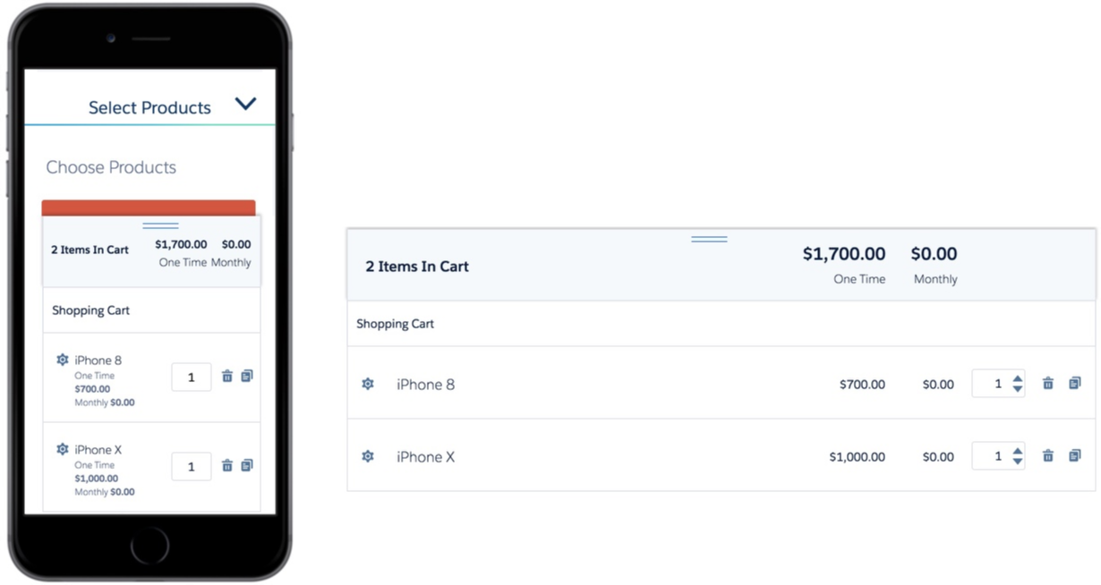
- I rapidly designed and built the working demo UI in accessible HTML & CSS, ensuring the compare in cart was mobile-first responsive - using smart responsive code to avoid a complex table layout, while providing clear organisation of product names, features and prices against each cart item.
- I paired with a javascript engineer to complete the slider feature changes tool - I found a suitable open source javascript plugin that the engineer could easily customise to fit with our demo requirements, and completed the accessible UI HTML & CSS development while he integrated the plugin to make the slider function as required on user input.
The Outcomes
- We were able to rapidly and successfully complete and present the working demo that met all the requirements of the bakeoff in 2 days (after a late change in requirements).
- Ensuring the design and UI development was responsive and accessible enhanced the presentation as it rendered correctly on a smaller than anticipated screen resolution when the head of presales presented via a bright projector screen.
- Vlocity won the bakeoff and the M1 contract.
- I won a Vlocity 'Rock Star' award for my significant and critical role in the completion of the contract winning bakeoff demo.
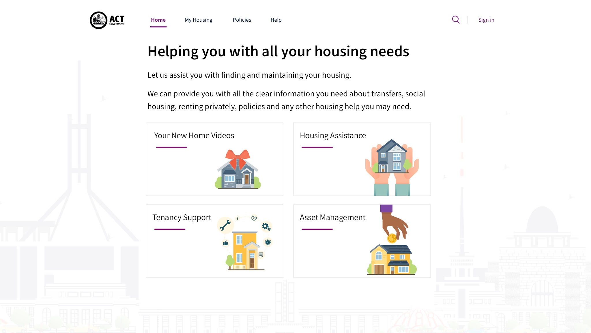
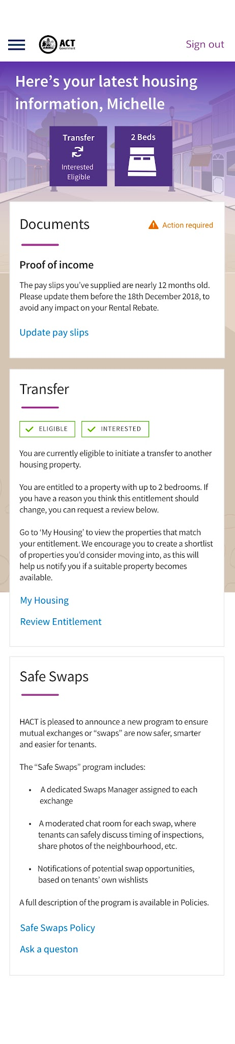
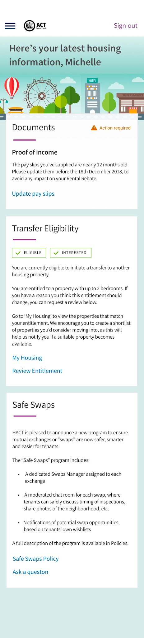
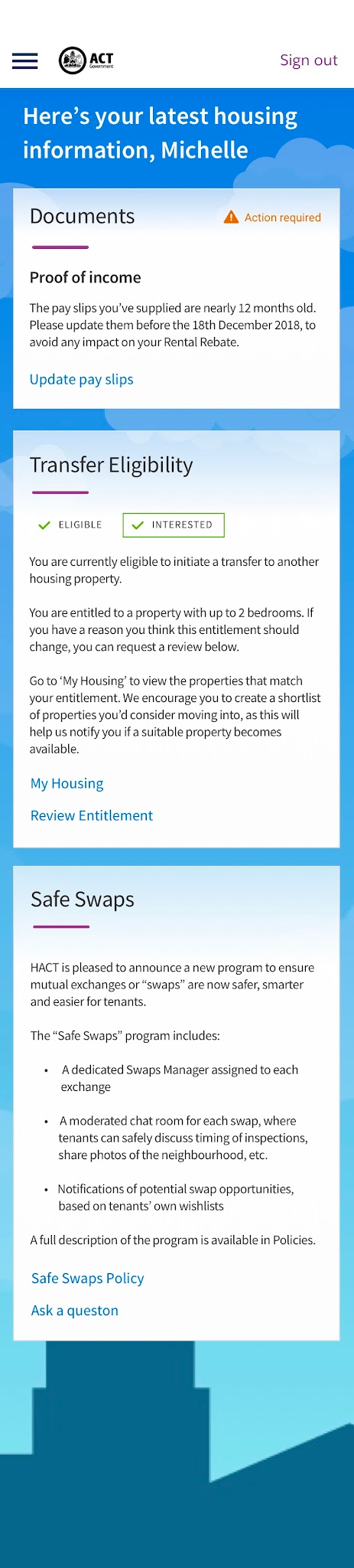
ACT Government 'My Housing' Self-service Portal Sales Demo
The Problems
Rapid UX & UI design and prototype development in the Vlocity Public Sector Cloud to assist the Vlocity Solution Engineer with their sales demos for the ACT Government. Requirements included:
- An unauthenticated ACT Housing homepage with links to information pages and the portal sign in page.
- Three mobile-first themes for the authenticated portal experience built on the Vlocity/Salesforce Experience Cloud.
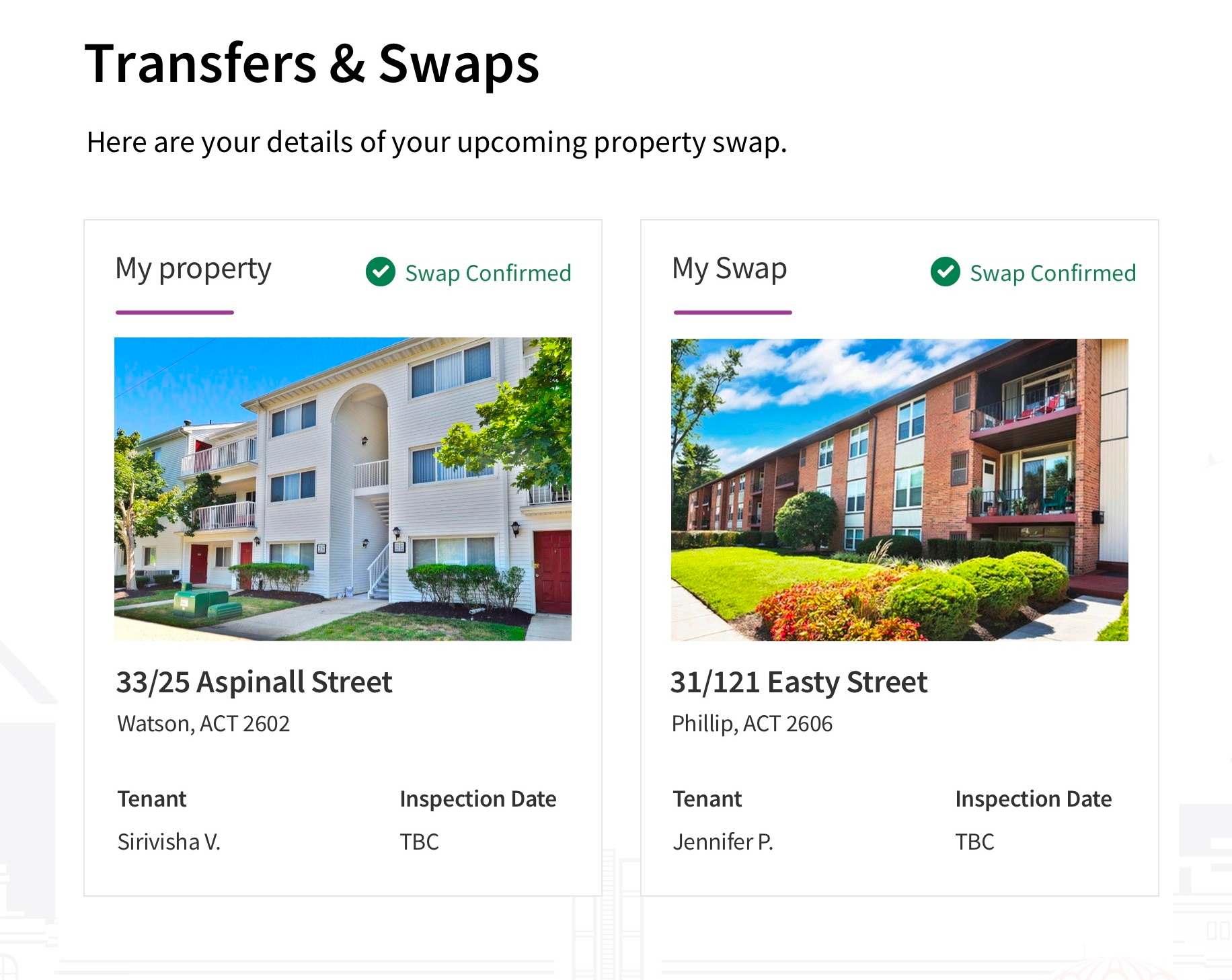
- A functional 'Transfers & Swaps' page where users can self-service to add their property to the transfer & swaps list and manage their property and preferences.
The Solutions
- I completed rapid UX & UI design and development in the Vlocity platform using the Newport Design System CSS framework to complete the different UI themes.
- I paired with a javascript engineer to complete some of the Transfers & Swaps self-service features.
The Outcomes
- A fully functional working demo in the Vlocity platform that met all the requirements.
- Proven speed of the Vlocity platform to reduce development effort.
- Demonstrated the ease and speed of applying different UI themes to the Experience Cloud.
- Positive customer feedback.
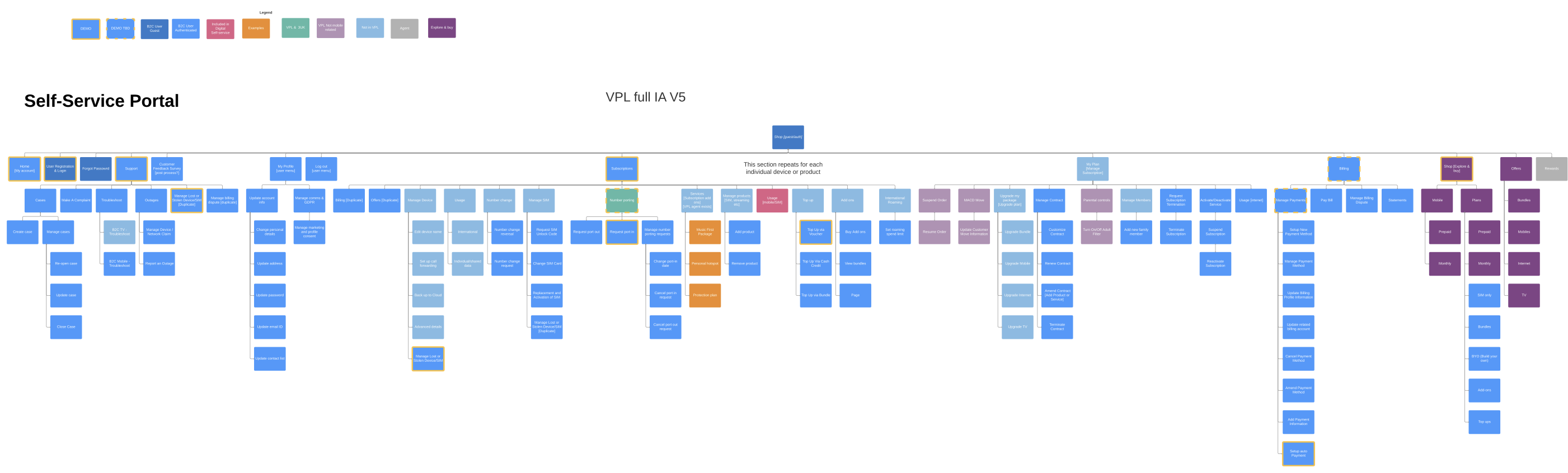
Vlocity Communications Cloud Service Agent Console UX & UI Design
- I was the lead UX & UI designer for the Communications Cloud 'Productized Segment' team.
- We created new omnichannel features for the agent service console including in-life process flows built using Vlocity Omniscript.
- I had to understand and plan the future-state B2C self-service IA in order to design a robust, scalable UX that would eventually be driven by the self-service portal and the end user problems and goals that directly impact the Agent Console UX.
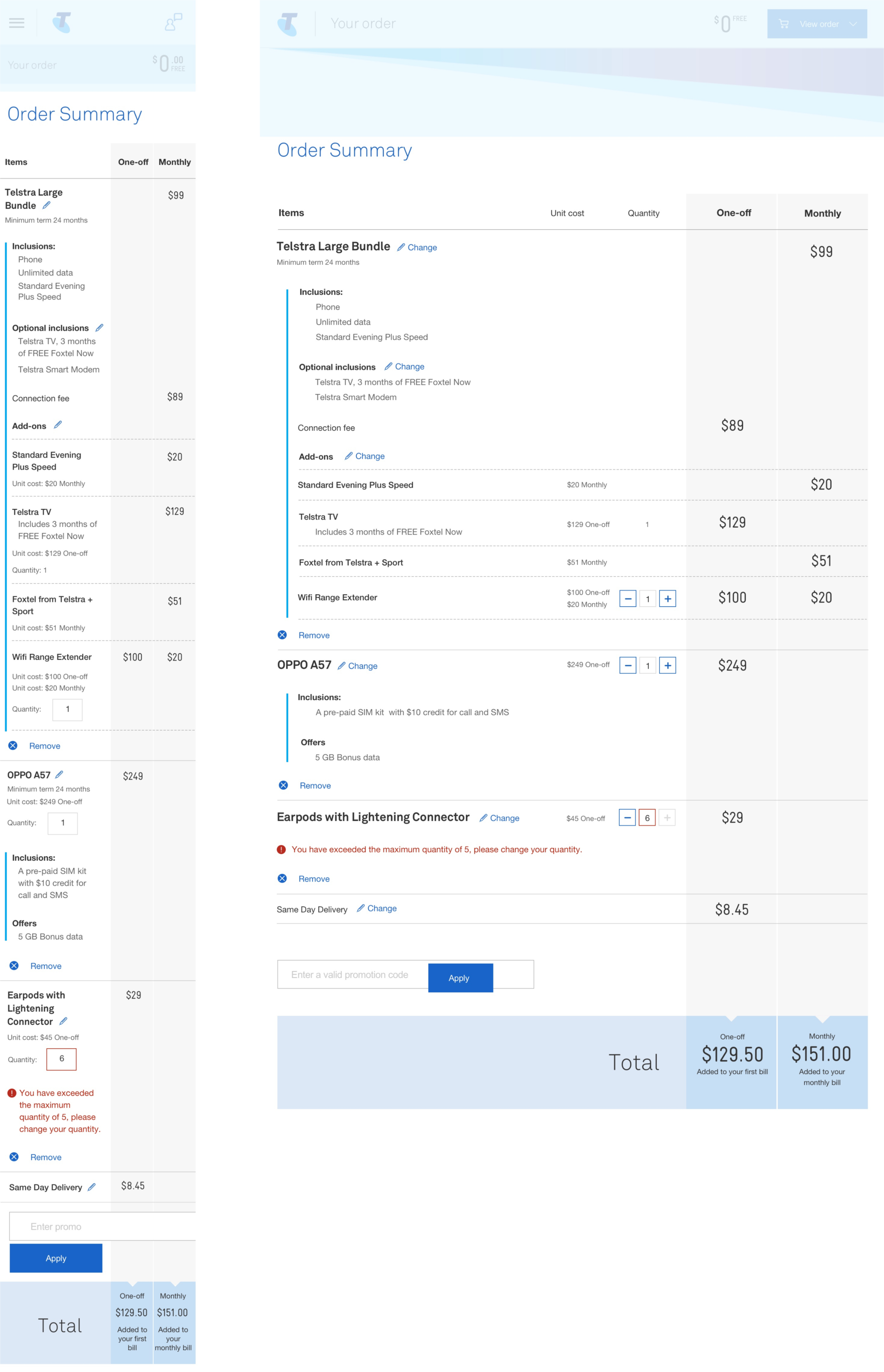
Telstra Ecommerce Checkout
The Problems
Creating a 'Product to Order' checkout flow using the Vlocity Communications 'out of the box' (OOTB) features.
- The Telstra design team were using Vlocity to create their new ecommerce checkout journey
- Tesltra's UX & UI designers needed to understand the freedoms and limitations of the OOTB features in order to minimise customisation
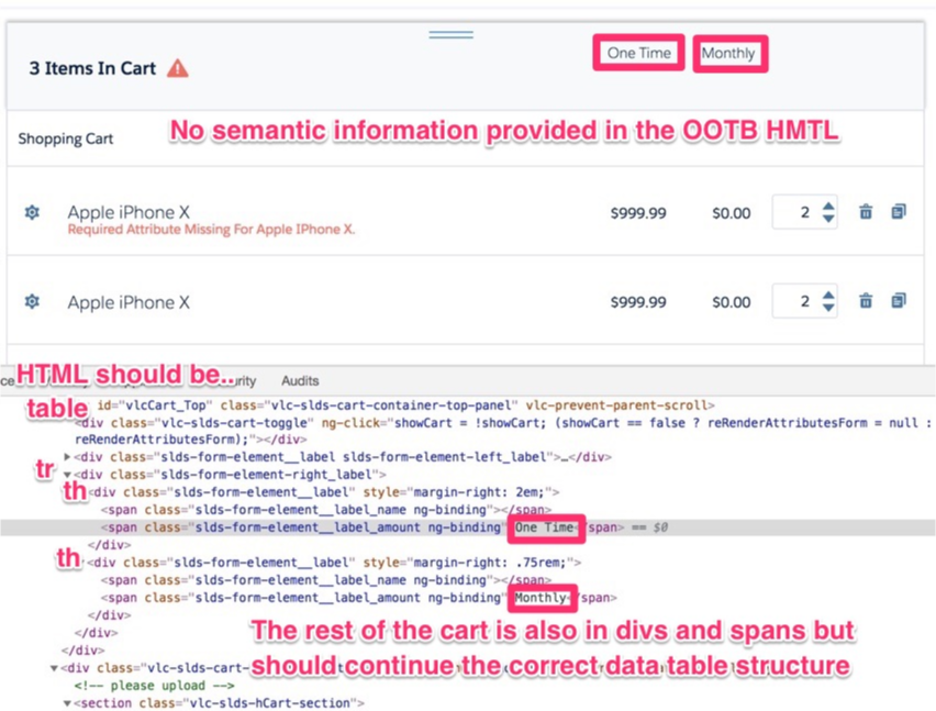
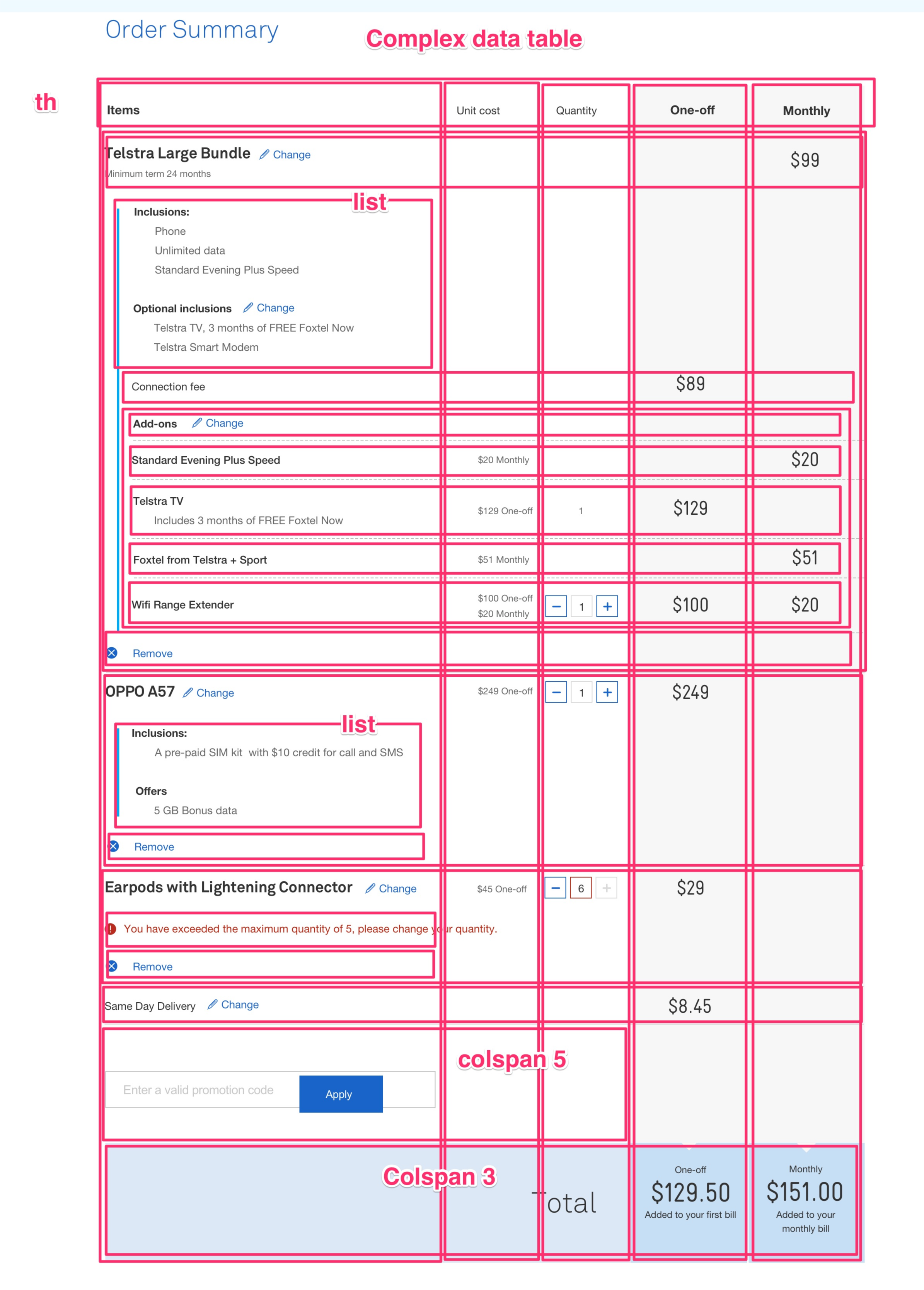
- They also needed guidance with accessibility guidelines for accessible UI design and UI development annotations to ensure WCAG 2 conformance with the new design

The Solutions
- Maximising Telstra's UX objectives, commitments and measures of success with the move to the Vlocity Communications platform on top of Salesforce.
- Providing general UX & UI feedback in line with UX heuristic principles, accessibility, ethical and inclusive considerations.
- Annotated designs to show how mobile-first UI HTML is structured to conform with OOTB and WCAG 2 accessibility.
- Interactive rapid prototype to demonstrate OOTB checkout flow and features.
The Outcomes
- I enabled the Telstra UX team to keep on track with their release timeline and objectives by identifying issues resolving blockers.
- I created a UX Risk Register to track and provide resolutions to issues identified by myself of requested by the UX team.
- I enabled the team to avoid unnecessary additional UI engineering custom code and technical debt by ensuring the designs were always accessible and aligned with Vlocity OOTB.
- I also created and presented an 'Accessible Vlocity Mobile-first UX Design and Design Systems' presentation to the Telstra UX Manager to enable the team to start considering an acceassible 'Atomic' desin system approach within the team to aid building a library of resuable accessible UI components.